IFOP
Polls for french presidential election

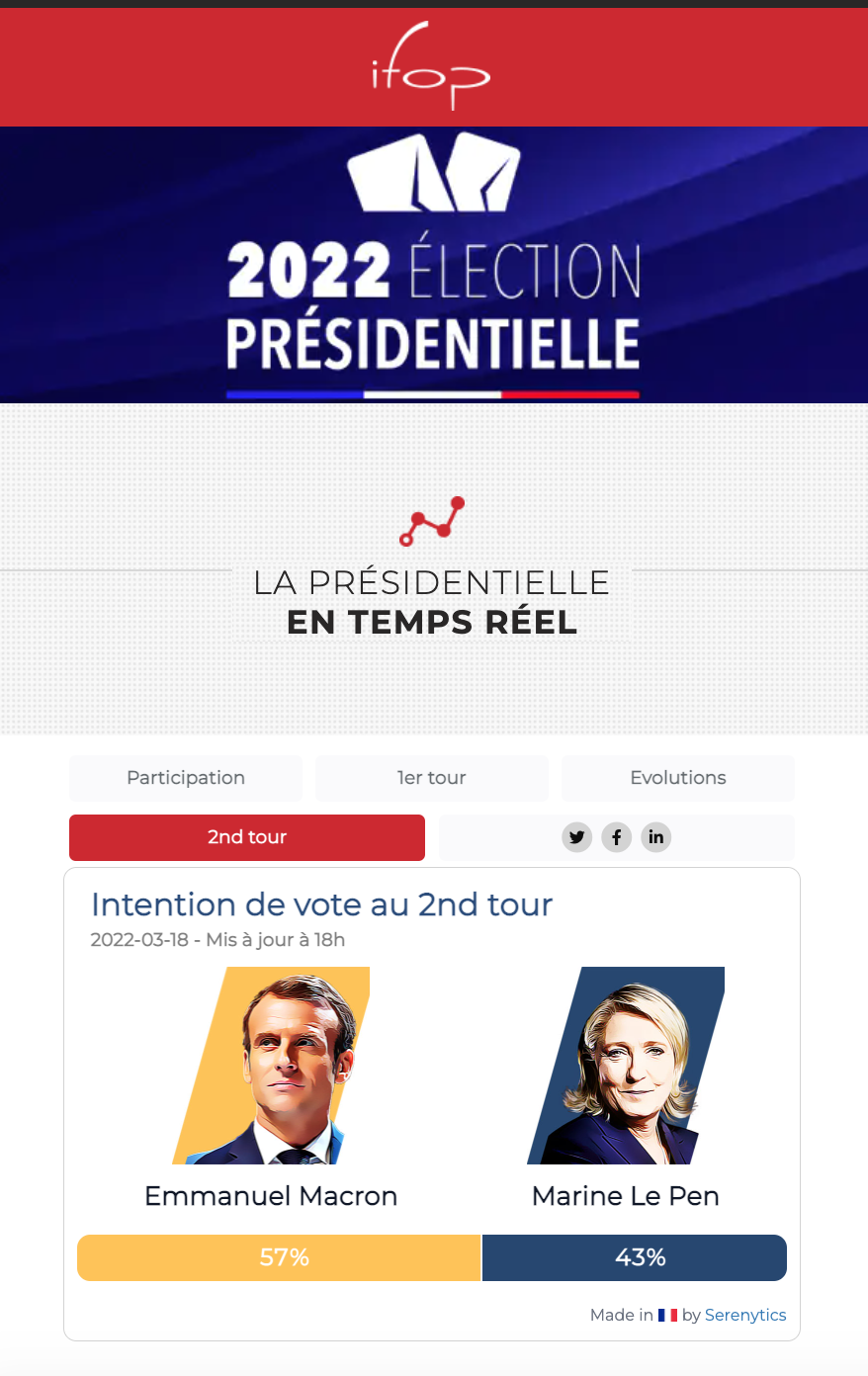
Live version: https://www.ifop.com/presidentielle-2022/
For the french presidential election of 2022, the IFOP polling agency runs daily polls. Serenytics has created a dashboard to visualize these results. The requirements were that the dashboard had to:
- be embedded in the IFOP Worpress website
- be perfectly responsive
- be compliant with a design theme provided by IFOP (fonts, images, colors)
- handle a load of 200.000 views by day
- allow the user to access screenshots and GIF to share it on social networks (to be generated everyday by Serenytics)
- allow the user to download a PDF file with a daily analysis of the election
- include a menu to navigate between content (1sr round, 2nd round, evolution, social networks)
Moreover, the update had to be fully automatic (from XML files dropped everyday on an SFTP server). And the time for this update was not allowing any latency or error (files are dropped at 4pm and the dashboard must be live at 6pm everyday).
The project had to be achieved within one month.
Data is pushed every day by IFOP to an SFTP server (as XML files). The SFTP is part of the Serenytics platform.
We wrote a parser in Python to read the content of the XML files. The data is then loaded in the Serenytics internal data-warehouse (a PostGreSQL server for this project).
For this step, it uses the feature to run/schedule any Python code in the Serenytics platform. And because Serenytics embeds an SFTP server and a datawarehouse, there is no additional IT to manage.
First, we asked one of our designers to create proposals using Figma, and one of them was chosen with the customer.
Then, we created the corresponding dashboards in Serenytics. Some of them have been created in low-code to obtain the exact design we wanted. For example, below is a screenshot of a custom component to display the picture of a candidate, its score, and the indicator of the evolution of its score:
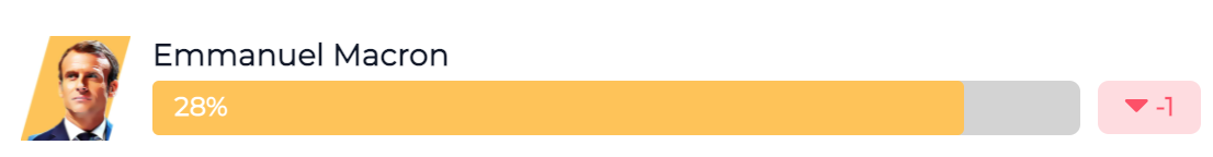
For example, the low-code feature of Serenytics allows to easily change the color of the rectangle on the right (to show the score evolution) between red/green if the score is up/down from the day before. Because its uses low-code, we were able to use the exact layout defined by the designer in Figma (e.g. the bar and the candidate name having the same height as the candidate image).
Then, several components of this type are used to show all the candidate scores. The number of candidates can change and the components had to handle it.
In this project, being able to edit the dashboard's CSS is a very important feature (for example, we used it to customize the bars animation).
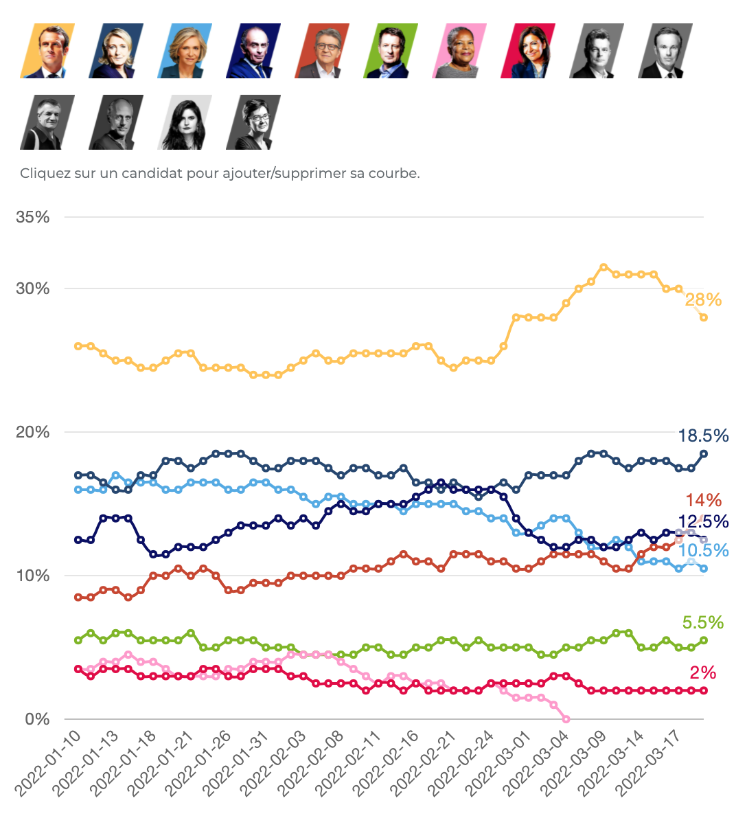
In the widget below, we use low-code features to create a custom dynamic filter: the user can click on the candidates images to show/hide their curves (and if a candidate is not selected, its image is greyed). And the curves widget below is the default one from our library (added in a few clicks, without code):
The created dashboard is then embedded within the Wordpress website of IFOP. This embedding is done with an iFrame and a small JS package to ensure the resizing is correctly handled.
This integration was very simple to achieve and didn't raise any issue.
Everyday, once the data is imported, a Python script generates screenshots from the dashboards to provide easy-to-share images. As our python module provides a function to generate a screenshot from a dashboard, this was very easy to setup. Once generated, the screenshots are loaded to AWS S3 (easy to achieve with a few lines of Python).
In a similar manner, a script generates a GIF file for the 1st round animation (and a second GIF for the candidates' scores evolution over time). Generating GIFs is a bit more complicated than static screenshots. We had to write a script that generates several screenshots, and updates a dashboard's variables between each screenshot to update the dashboard animation. This last step is simple as a dashboard variable can be modified by a simple API call. Once generated, the GIF files are also uploaded on AWS S3.
Everyday, as soon as the XML files are available on the SFTP server, the data is imported and screenshots and GIF are generated.
When this is achieved, an email is sent to project managers with the link to this staging version. So they can have a first look on it before it is published in production at 6pm.
At 6pm, the dashboard in production is modified to show the data of the day. This is done by a simple API call to modify a dashboard's variable. Again, an email is sent to all the people involded in the project with the dashboard link. Sending this type of emails with custom content is very easy, as there is a helper function in our Python library to send emails.
To handle the load, the Serenytics cache is enabled. This means that when the data is updated, when the dashboard is loaded for the first time, it will generate queries run on the datawarehouse where is stored the data (ie. the PostGreSQL server). And the result will be stored in the cache engine (a very fast Redis database). Then, when the dashboard is loaded again, it will only read the queries' results from this cache, and no SQL query will be generated. With this feature, we already reached 110.000 dashboards' loads by day without any slowdown.
You want to know more on this type of project? Contact us at contact@serenytics.com.