Create an KPI showing data from multiple data-sources in HTML

In some project, you need to create a very custom widget showing data from multiple sources. To reach the exact design you want, you can use HTML/CSS to create your widget.
Here is an example that we will build in this tutorial:
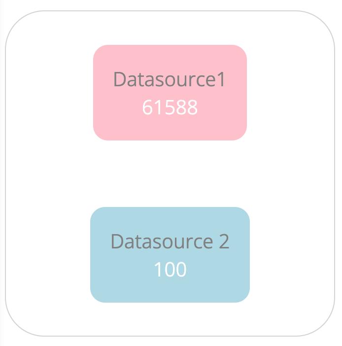
In this widget, the first KPI is from Datasource1 while the second one is from datasource2.
In the following paragraph, you will learn how to create this type of widget.
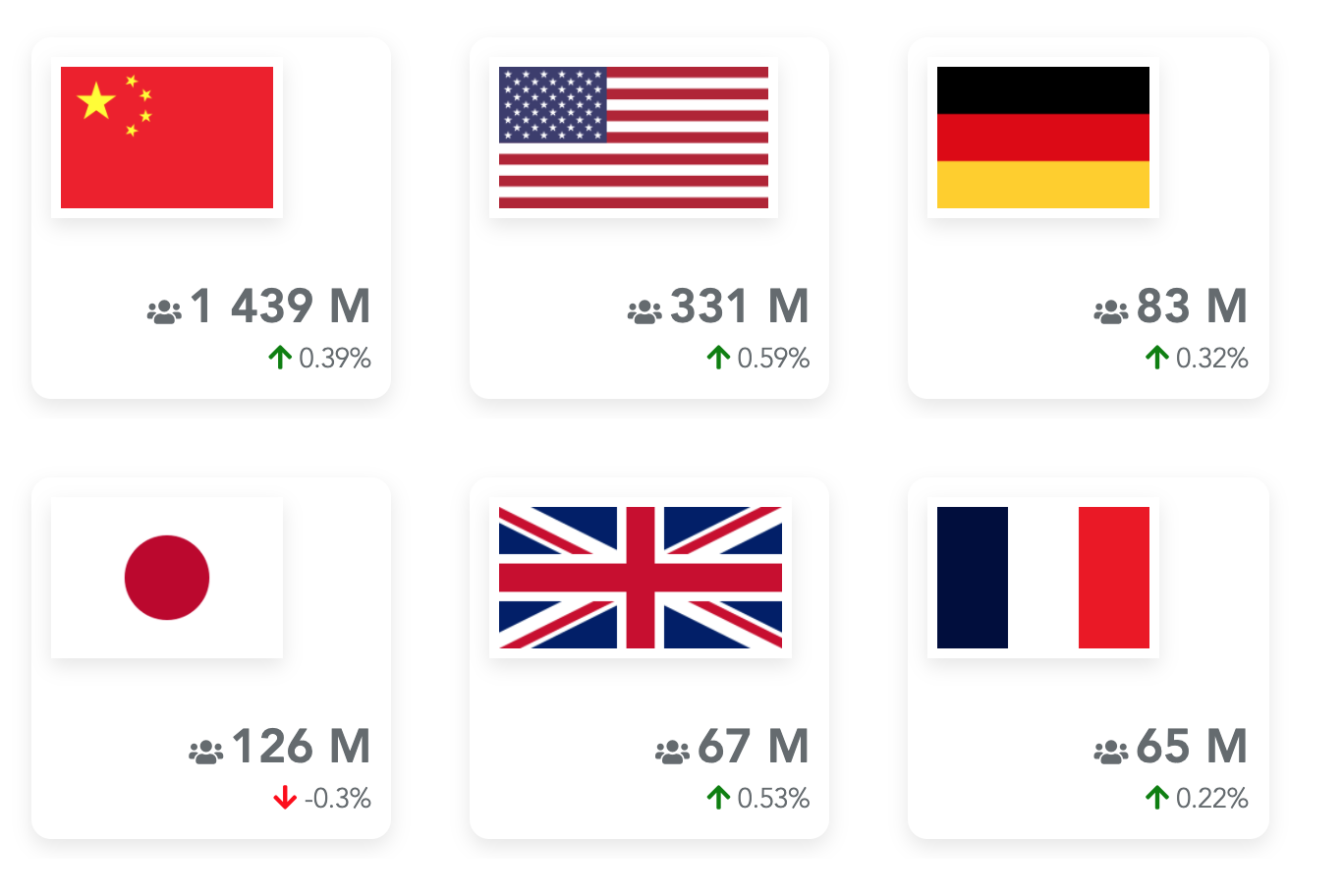
Here is another example of what you can achieve using the same principles explained in this tutorial:
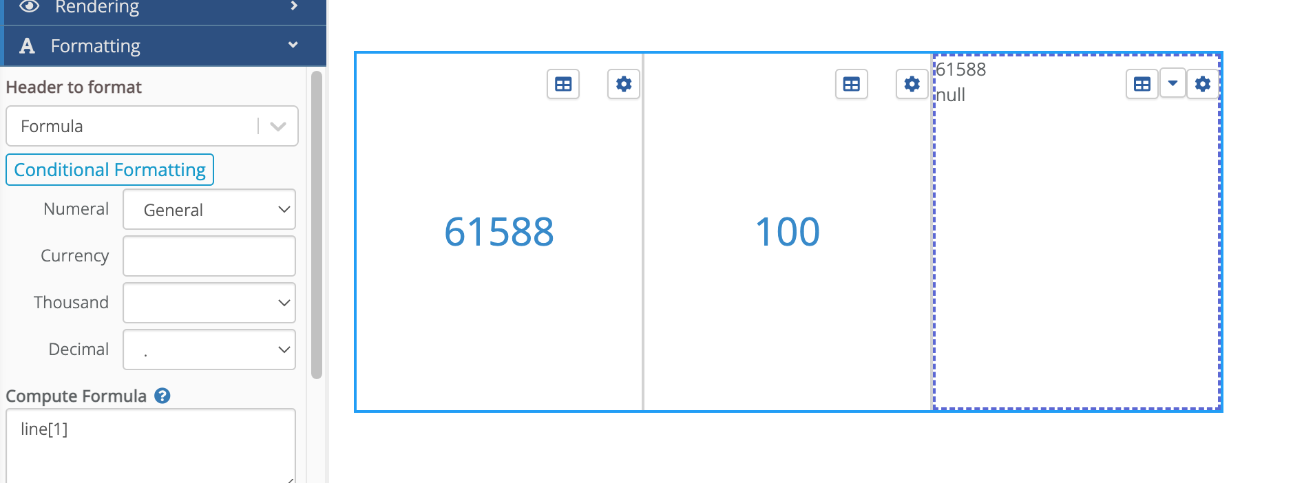
The very first step is to create a free table with one row and three cells:
- Configure the first cell in Value mode to get the value from datasource 1.
- Configure the second cell in Value mode to get the value from datasource 2.
- Configure the last cell as a formula cell and use HTML as the Rendering mode.
You should get something like:
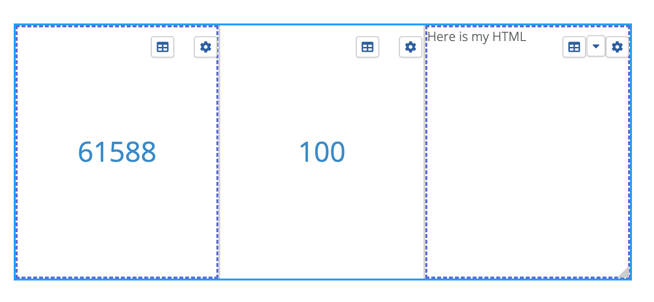
Here, I typed 'Here is my HTML' in the html code of the last cell.
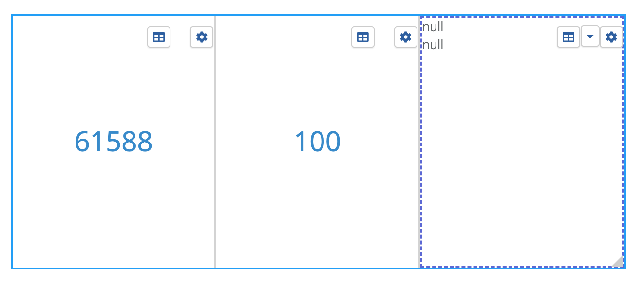
In the HTML of the last cell, enter the following code:
<div>{{value1}}</div>
<div>{{value2}}</div>
Value1 and value2 are variables containing the cell data. But because you have not defined yet any data for this cell (the third one), you get:
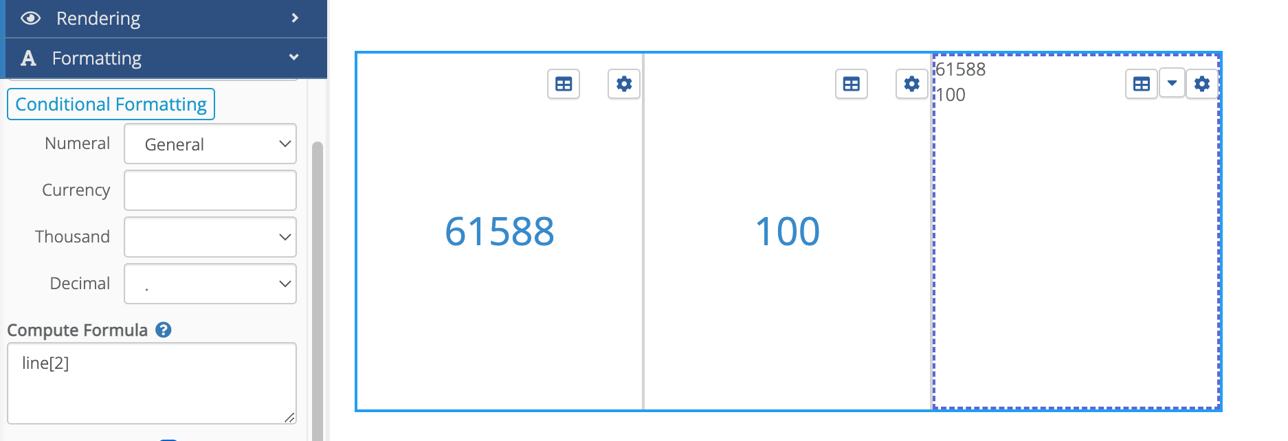
To fill value1 with a variable, edit the first formula of the cell (usually named Formula 1). And in its compute formula, enter line[1]:
You can see in the cell that the first null value has been replaced by the value of the first cell.
For the second variable, you need to create a second formula in the Data section of the cell. And then configure this second formula with line[2]:
Now, we have access to both formulas in our HTML custom code. The final step is to enhance the design.
The first step is to hide the two cells on the left. To do that, in the 'Columns width' settings of the widget, set 0 for the first two columns:
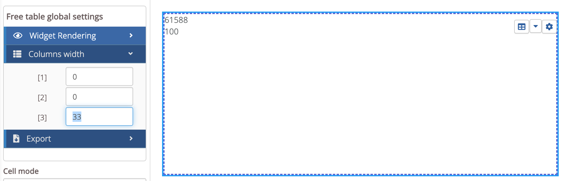
This will hide both columns.
Then, in the HTML code, you can customize the widget the way you want. Here is a small example:
<div style="display:flex; flex-direction:column; height:100%; justify-content:space-around;align-items:center;font-size:20px; border: 1px lightgrey solid; border-radius:40px">
    <div style="background-color:pink; padding:20px; border-radius:15px; color: white;text-align:center">
        <div style=color:grey>Datasource1</div>
        <div>{{value1}}</div>
    </div>
    <div style="background-color:lightblue; padding:20px; border-radius:15px; color: white;text-align:center">
        <div style=color:grey>Datasource 2</div>
        <div>{{value2}}</div>
    </div>
</div>
The above code works but is does not follow two good practices:
- Use snippets to be DRY (Don't Repeat Yourself): imagine you copy/paste the above widget 10 times. And then, you need to change it. That would be painful to modify the code in 10 places. Instead, you should put this code in a snippet and to reuse it in several places.
- Use CSS instead of inline styles: again, it's better to use a snippet to avoid copying your CSS in many places.
If you want a more in-depth content about snippets, here is the full documentation: Snippets doc.
To create the snippet, go in the Admin/Snippets tab. Then create your custom widget snippet using the code below. For this tutorial, I named it myCard:
<div class="myCard-container">
    <div class=myCard-entry style="background-color:pink">
        <div style=color:grey>Datasource1</div>
        <div>{{kpi1}}</div>
    </div>
    <div class=myCard-entry style="background-color:lightblue">
        <div style=color:grey>Datasource 2</div>
        <div>{{kpi2}}</div
    </div>
</div>
A first point is that is uses CSS instead of inline style. So you need to create these classes in a CSS snippet (create a new snippet and name it myCardCSS for example).
.myCard-container {
    display:flex;
    flex-direction:column;
    height:100%;
    justify-content:space-around;
    align-items:center;
    font-size:20px;
    border: 1px lightgrey solid;
    border-radius:40px
}

.myCard-entry {
    padding:20px;
    border-radius:15px;
    color: white;
    text-align:center
}
Another point is that we decided to replace the variables' names. We could have kept value1 and value2 but it is more practical and readable to rename it kpi1 and kpi2.
In the dashboard, in the custom code of your widget, you can type:
{{snippet::myCard(kpi1=value1, kpi2=value2)}}
This code will instanciate the snippet myCard and pass the variables kpi1 and kpi2 (filled with values value1 and value2).
You also need to embed the CSS snippet in the dashboard. To do that, in the advanced settings of your dashboards, in the Advanced Style Editor, in the CSS entry, type:
{{snippet::MyCardCSS}}