Create a table widget

In Serenytics, tables are very customizable. You can select as many dimensions and metrics as you need, add formulas to compute new columns based on other columns (e.g. a ratio), hide columns that are used only to compute a formula, add conditional formatting, insert icons, add links to other dashboards or to other applications (e.g. links to Salesforce)...
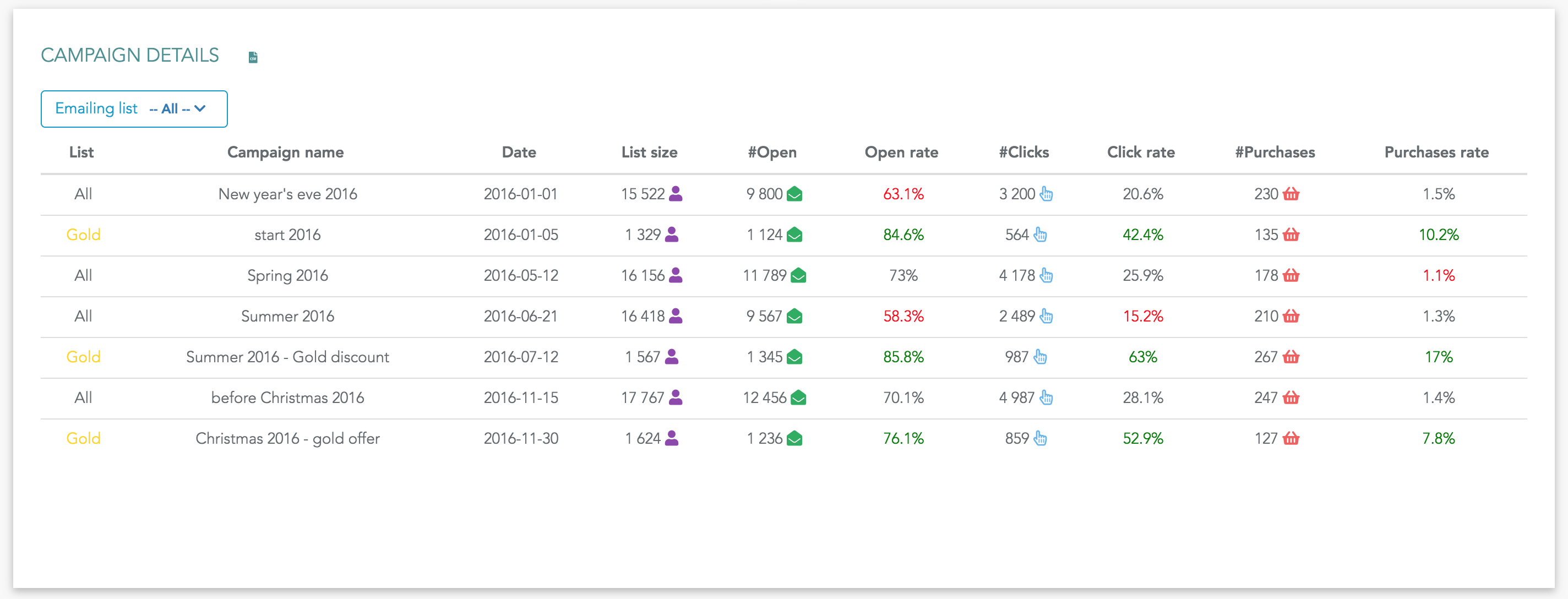
Here is an example of a table:
To create a new table, click on the table icon in the widget list:
Like for any widget, the first step is to select the datasource that will be used for this widget.
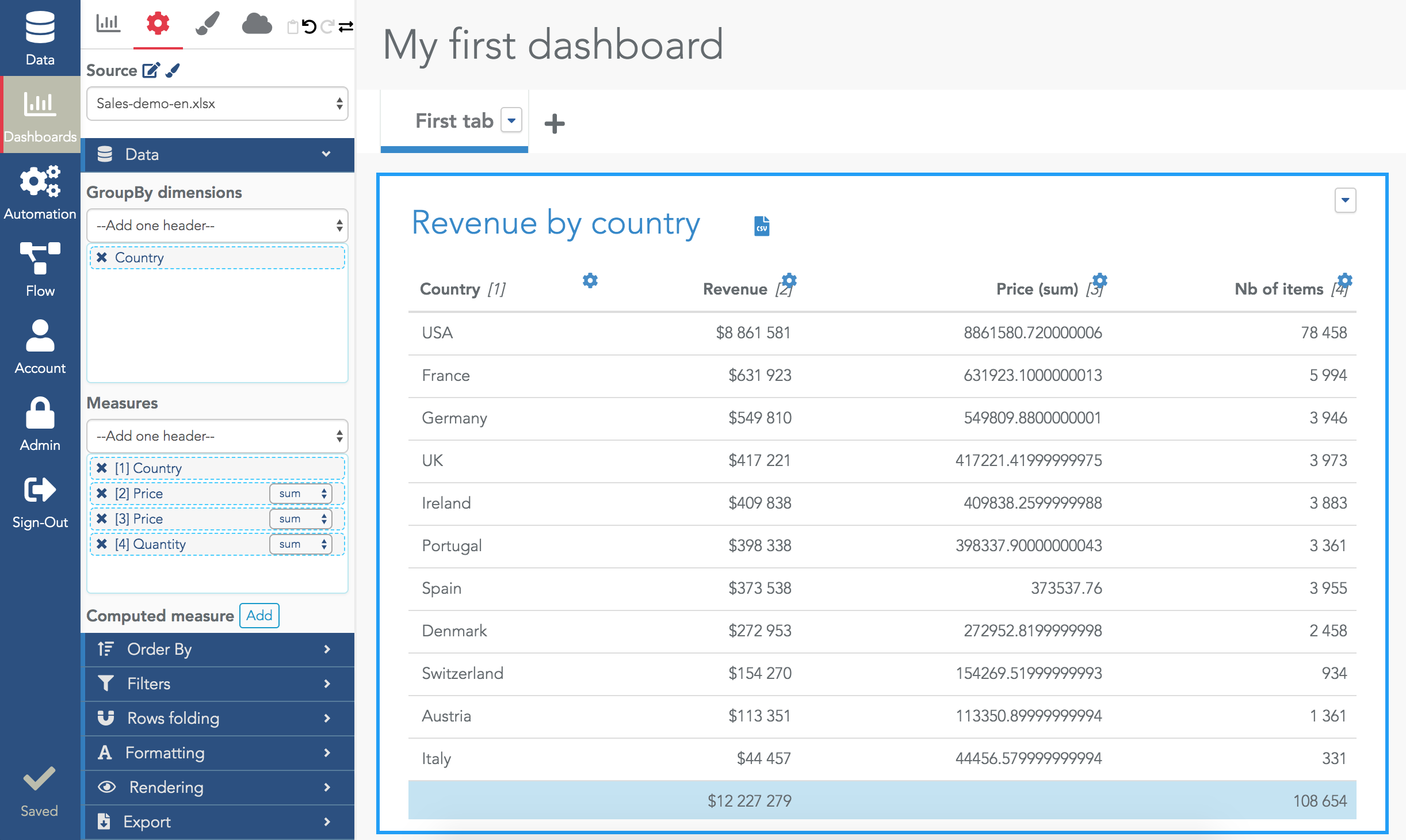
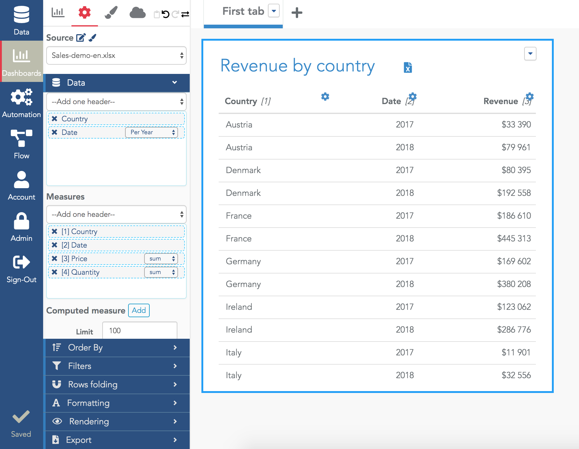
Let's use the query example: "sum of sales, sum of quantities grouped by country". In this example, the column country is the dimension, and columns sales and quantities are metrics (using the aggregate operator "sum").
To get the result of this query in a Serenytics table, select your dimensions and metrics in the Data section of the widget configuration:
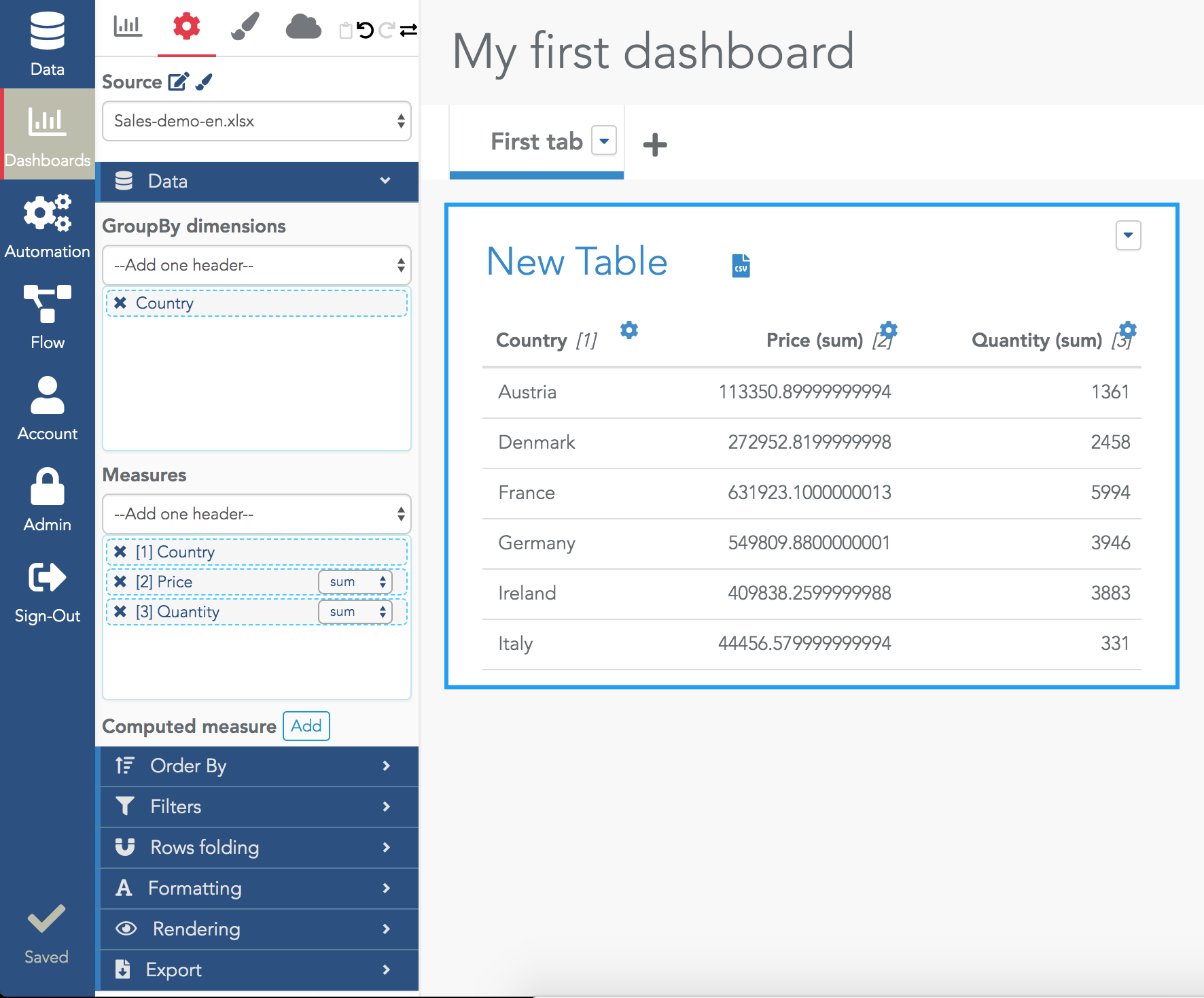
Note that when you select a dimension, it is also added at the beginning of the measures selector so you can reorder the table column if you reorder the values in this selector.
To rename a table, click on its title (default value is "New Table") and enter a correct name.
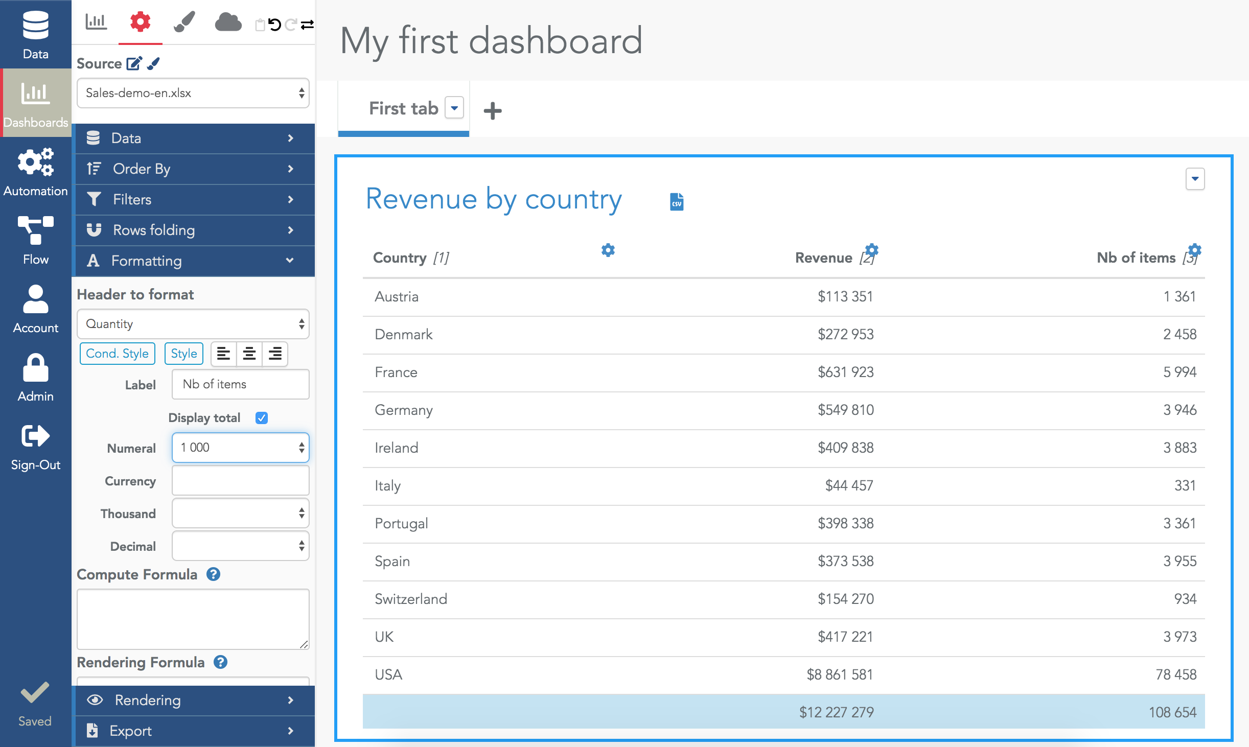
To rename a column, you can click on its title and enter a new column name (e.g. to rename "Price(sum)" to "Revenue").
To edit the formatting of a column (e.g. reduce the number of decimals), click on the cog icon on the right of a column name. And fill the numeral field (e.g. with $1000). The cog is a shortcut, you can manually open the Formatting section and select the column in the selector.
To add the total of a column, use the checkbox "Display total".
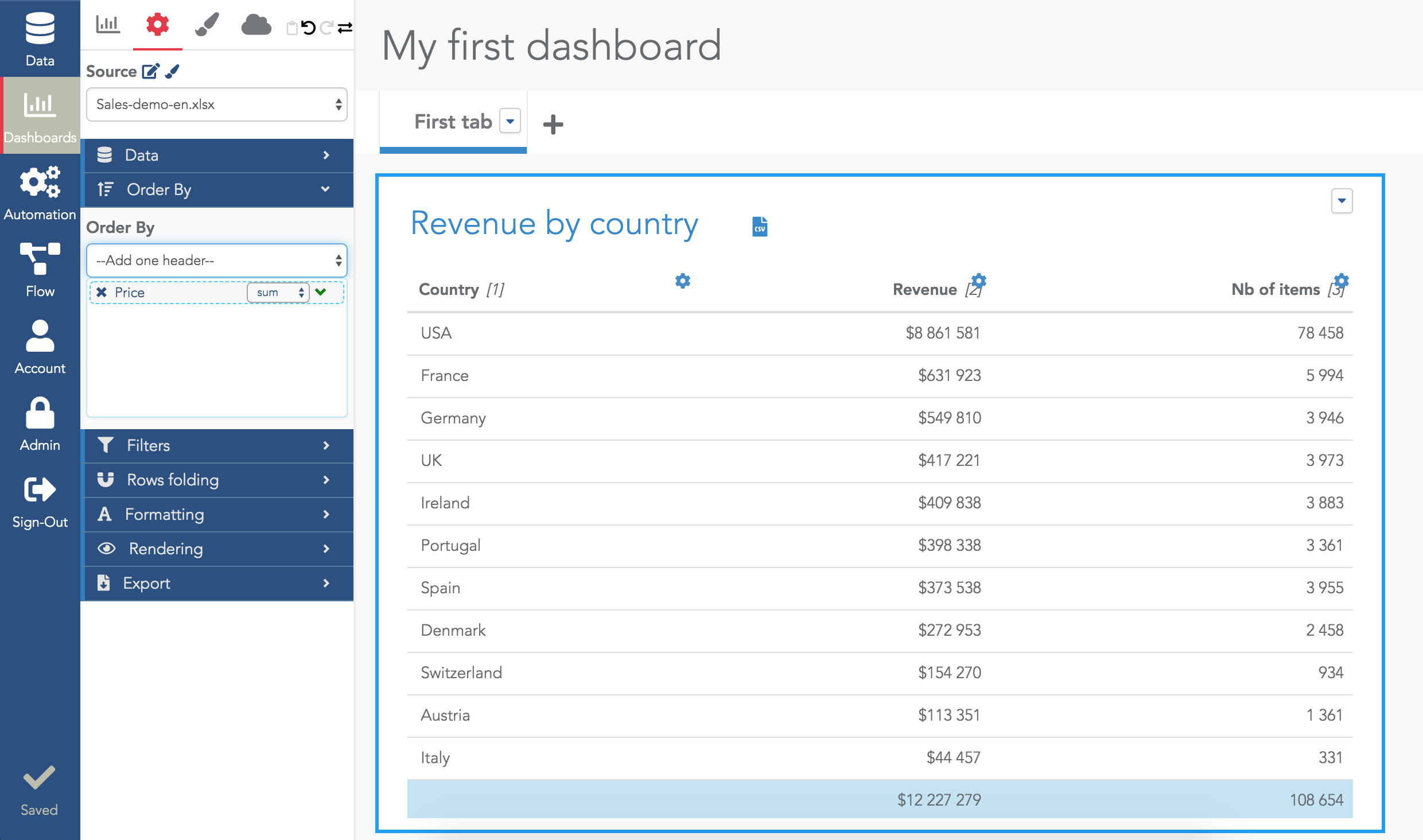
By default, rows are ordered along the dimension column. In the previous example, Austria appears first as it begins with an "A". Use the "Order By" section to select the column to use to sort the data.
Click on the little green arrow beside the column name used to sort the rows to switch between the ascending and descending order.
By default, only 100 rows are retrieved and shown in a table. This "limit" parameter is editable at the very bottom of the Data section. Using the above example, we can set it to 3 to get the top 3 countries per revenue:
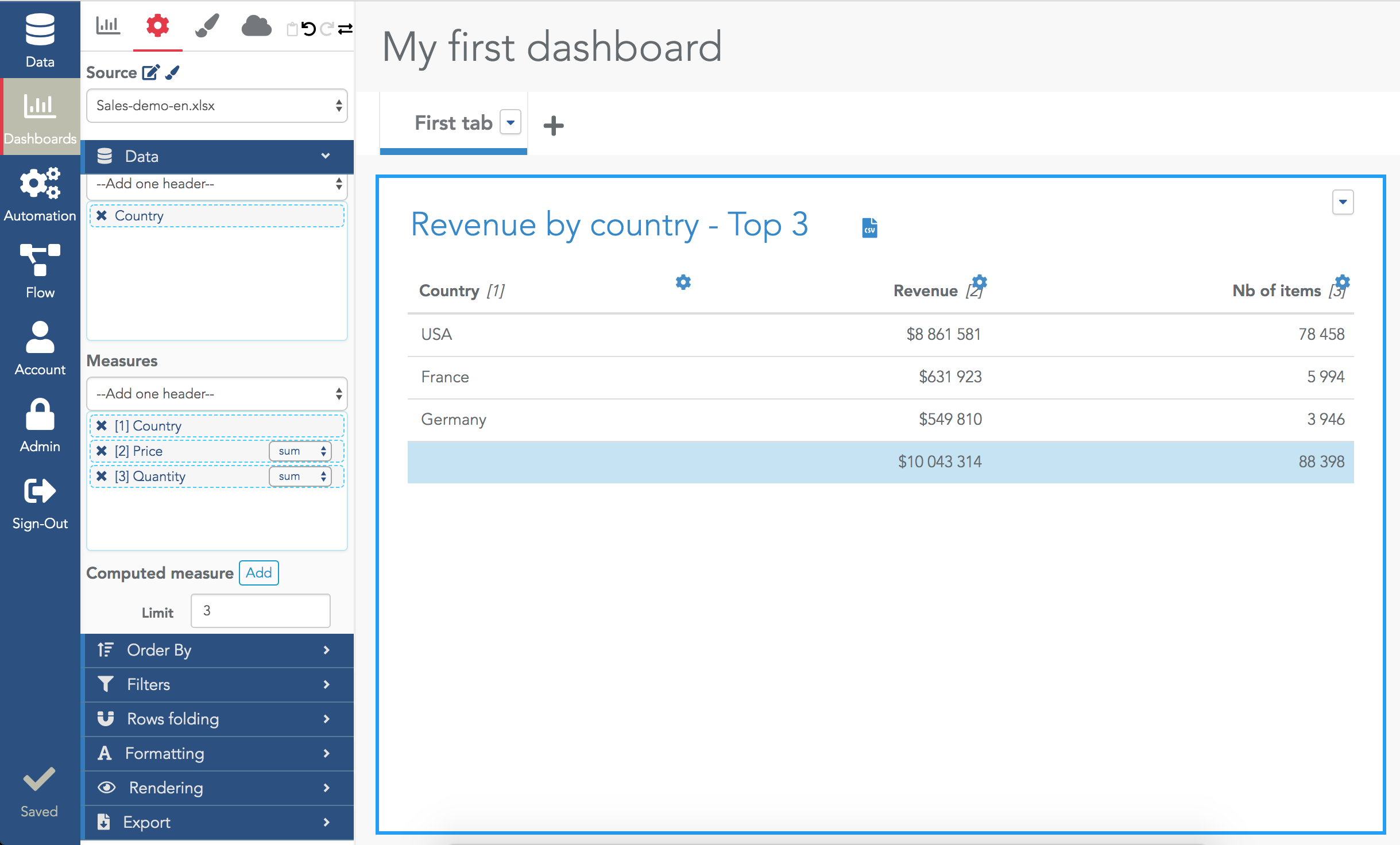
Note that the total is the total of the displayed rows, not the total of all the rows in the database (i.e. the sum of revenue for the top 3 countries, not the sum of revenues for all countries in our example).
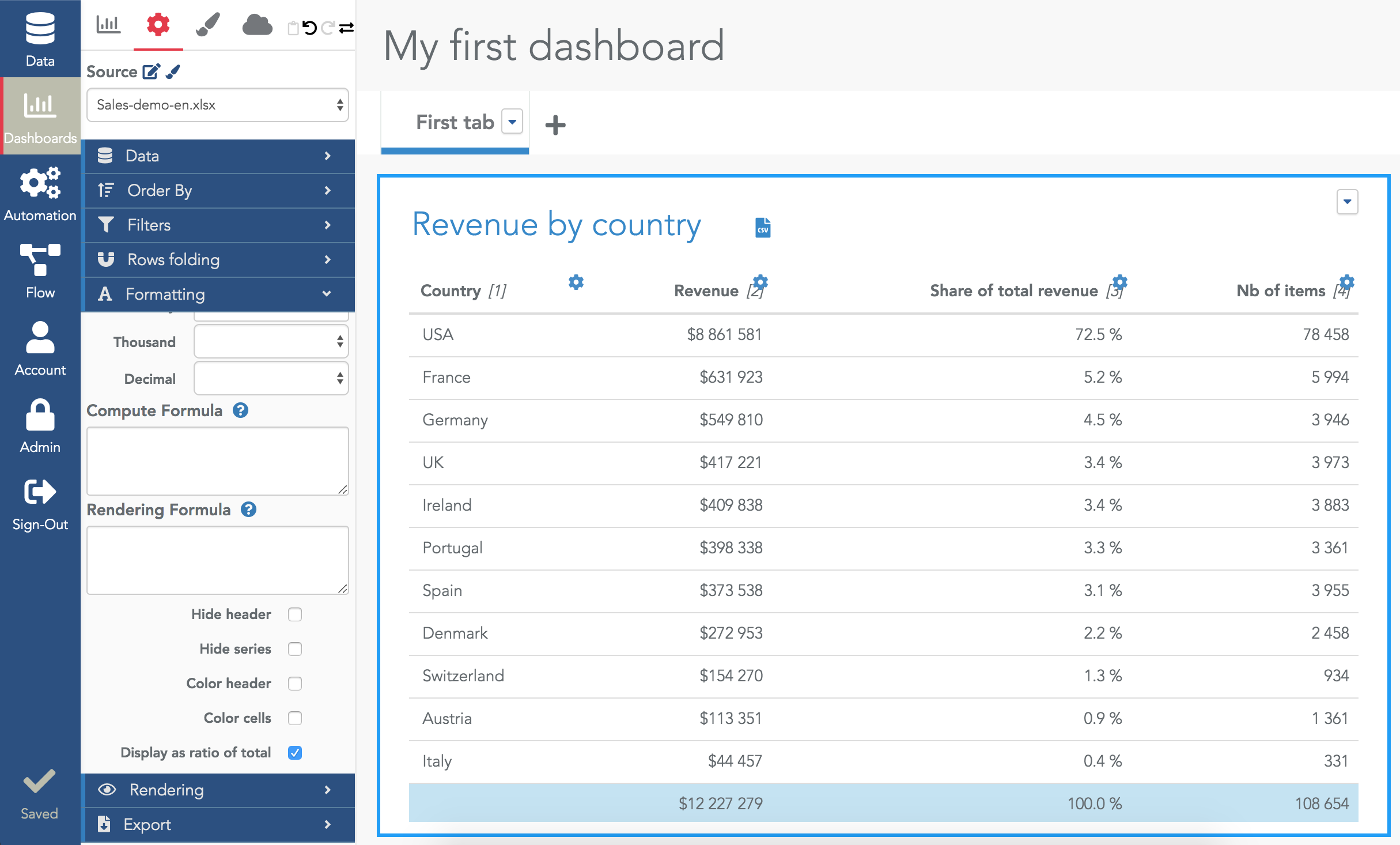
In our example, we want to display the revenue and also the share of the total revenue per country.
To do that, you need to select twice the measure "Price(sum)":
Tip: to reorder the column, you can drag&drop its name in the Measures selector.
Then, edit the formatting of the "Price(sum)" column you've just added (use the cog icon shortcut) and at the very bottom, activate the option "Display as ratio of total":
In the Data section, you can add a computed column by clicking on the button "Add" beside "Computed measure". Enter the column name in "Name" and enter your formula in the "Compute Formula" field. In this field, the variable "line" contains all the values of the row (e.g. "line[1]" is the value of the first column).
Here is an example to compute an average basket on the previous example:
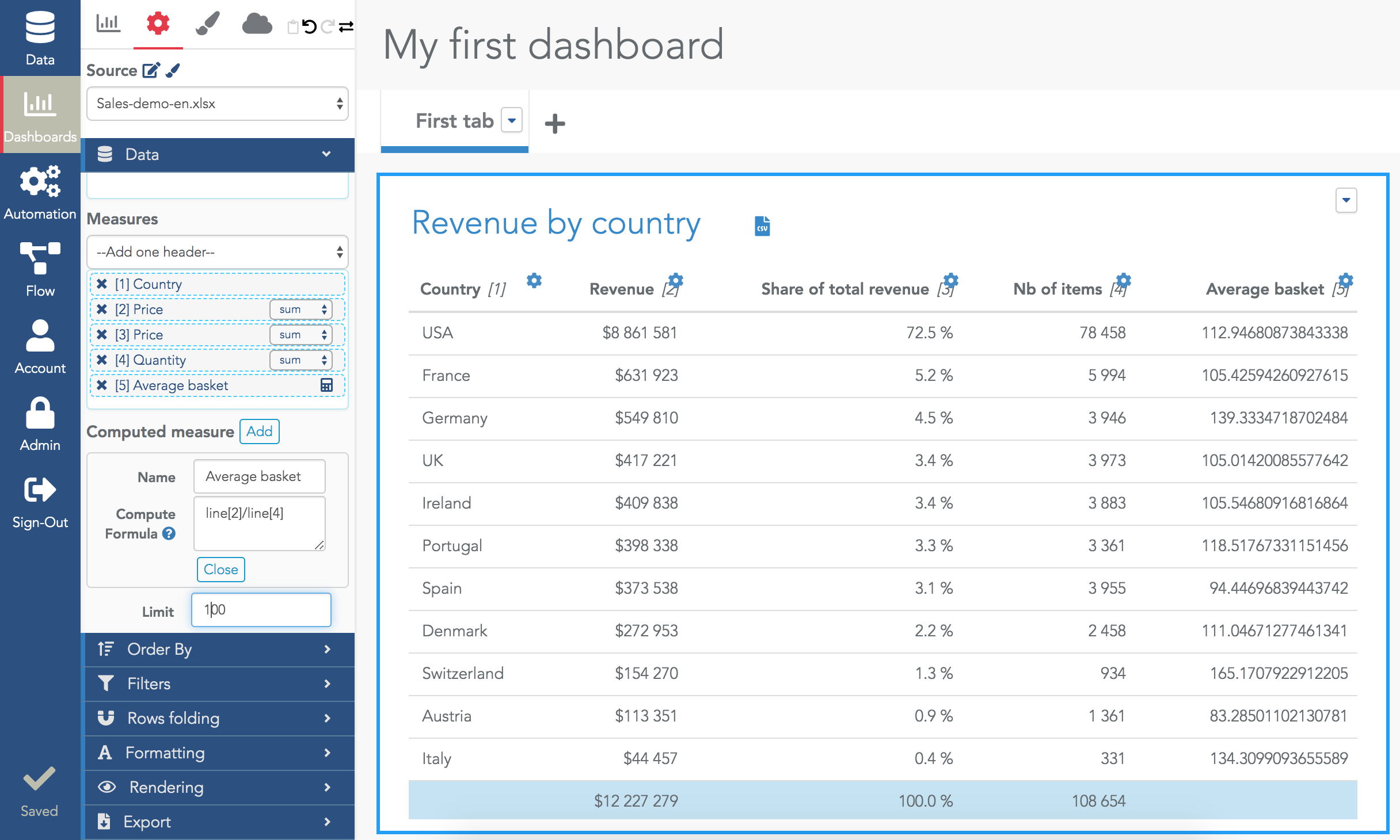
In this example, line[2] is the column "Revenue" and line[4] is the column "Nb of items".
Once your formula has been created, you can find it in the "compute formula" in the formatting section of your new column (use the cog as a shortcut to open it):

If you need a column to compute a new column but don't want to show it to the viewers, you can hide it using the "hide series" checkbox.
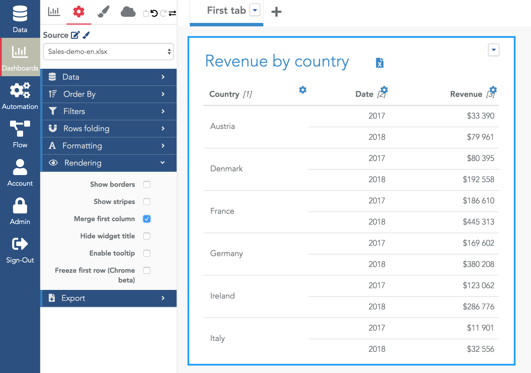
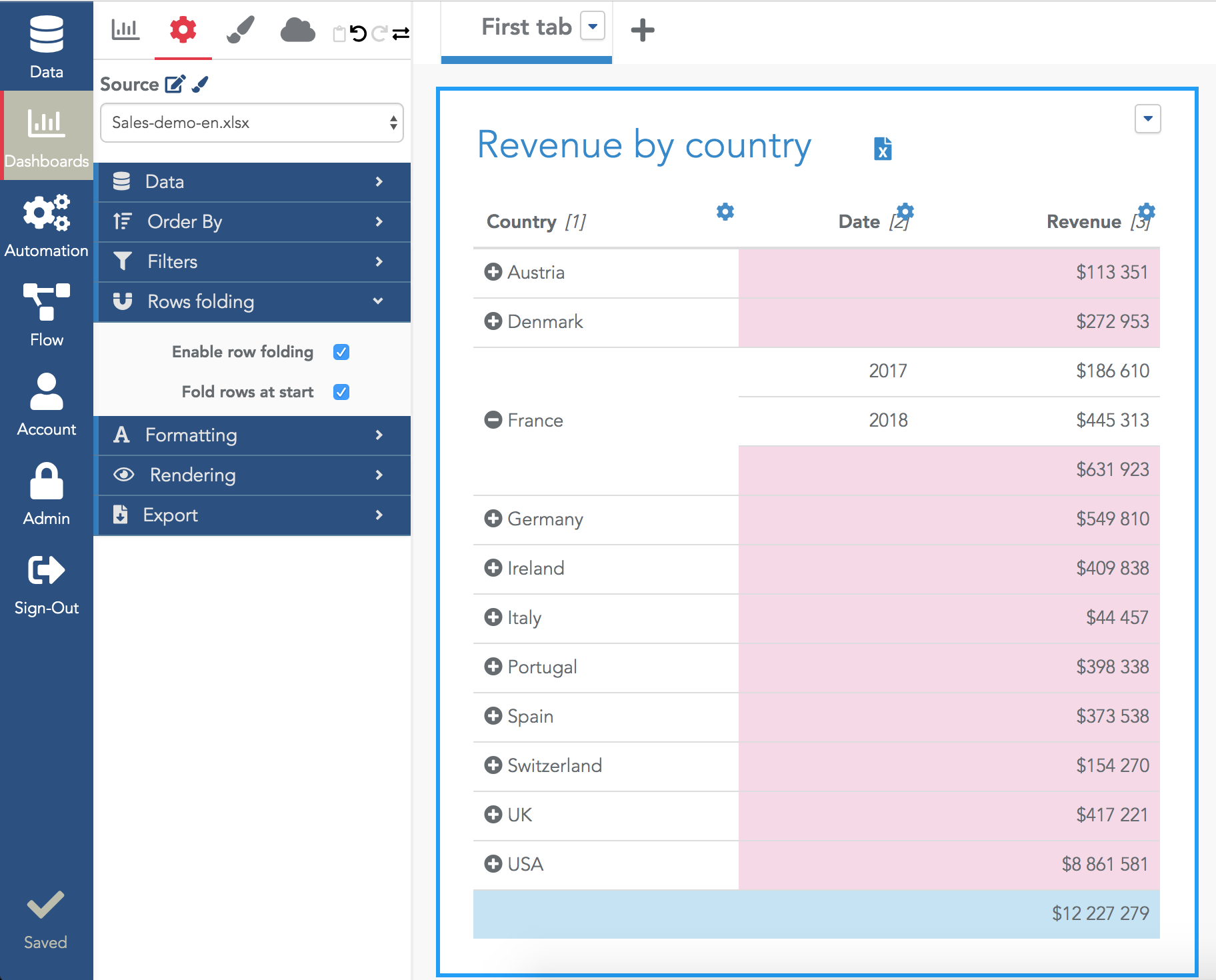
The viewer will see the intermediate totals (in pink) for each column and will be able to fold/unfold each value of the first column.
Advanced: the intermediate totals in a folded table always use the sum operator. If this is incorrect for your column, you can hide the intermediate totals for a given column in its Formatting settings with the option "Hide intermediate total" (at the very bottom of the section).
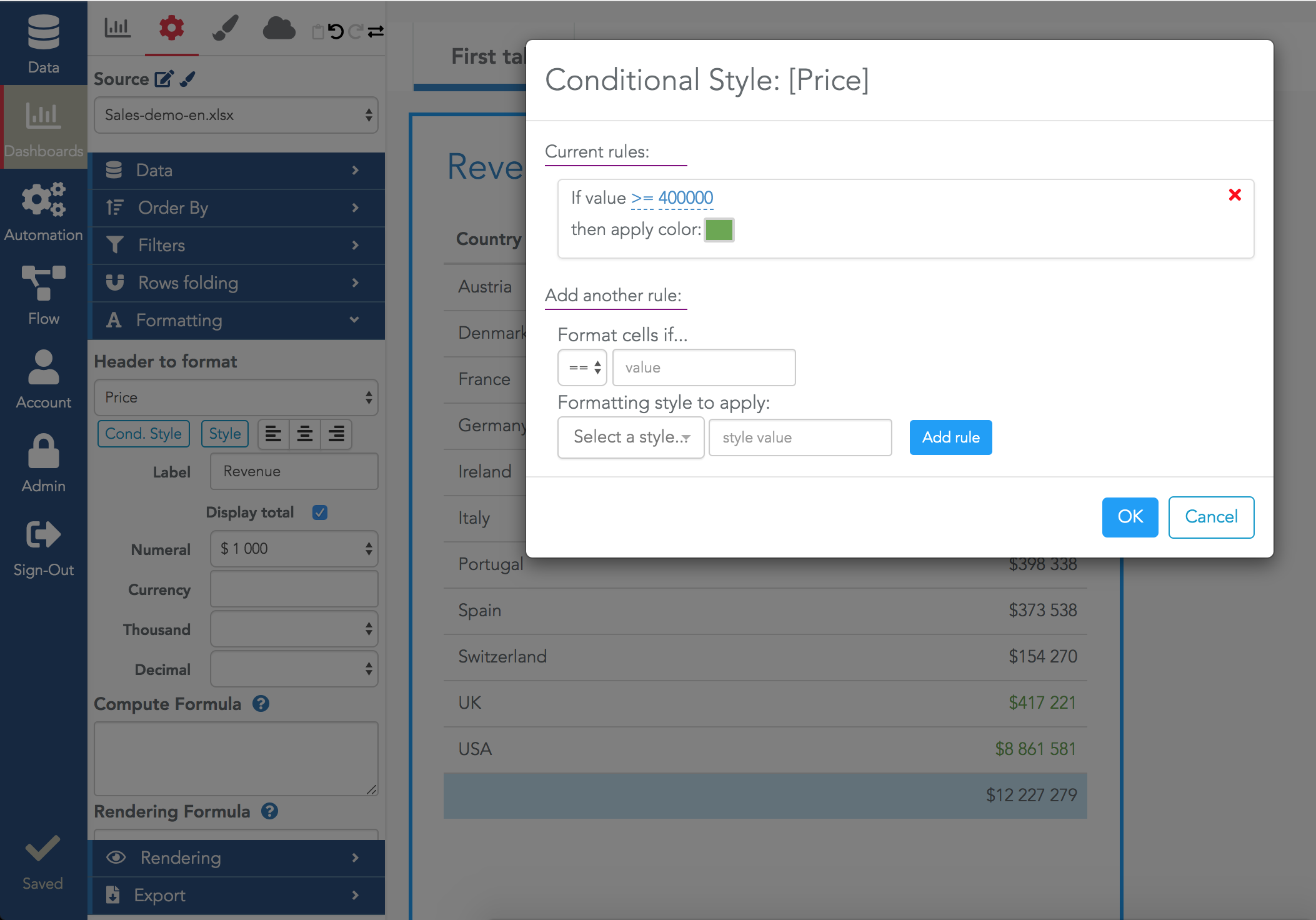
To apply a conditional formatting to a given column, open its formatting section and click on the button "Cond. Style".
From there, you can add rules to specify the style according to the value:
Using all the above features of the Serenytics tables, you will be able to create and share most of your data. Keep in mind that tables and dataviz widgets (e.g. barchart, piecharts...) do not share the same goal. A dataviz widget is very useful to track the evolution of metrics along time or to let the viewer very quickly compare a limited set of metrics. If the data is targeted to a viewer who wants to have many details and knows how to interpret this data, a table is often the tool to use.
A classical strategy in a dashboard is to have a first tab with the main KPIs and dataviz widget to give simple to read insights and other tabs with advanced tables where the viewer can dig into the details.