Create a KPI widget

A KPI widget is a widget showing one (or a few) numerical indicators: current annual revenue, number of users, average basket for an e-commerce site...
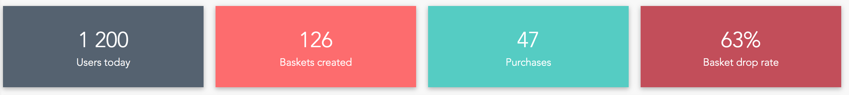
A good practice is to gather the most important KPIs of your activity in a bar at the top of the first tab of your dashboard, for example:
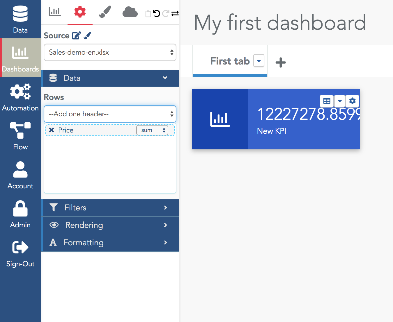
If you want to count the number of rows, use the $$count$$ special measure in the selector.
In most cases, selecting one measure is sufficient. To show more advanced measures (e.g. ratio of sales of one product category vs another category) you must create a value formula to compute it and then select it as the measure for the KPI widget (see the tutorials dedicated to formulas).
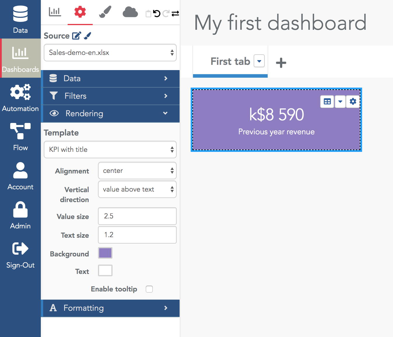
To rename the widget, click on the current text "New KPI" and enter your new text.
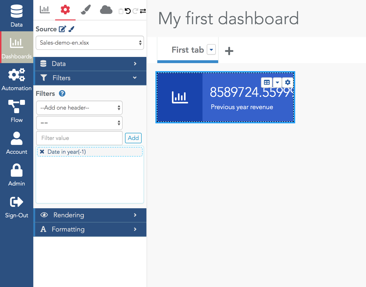
In many cases, you want to add a filter on your data. This can be done in the Filter section in the widget configuration menu. You can add as many filters as you need.
For example, to filter the rows to keep only the sales of the previous year, you can use the "Date in year(-1)" filter:
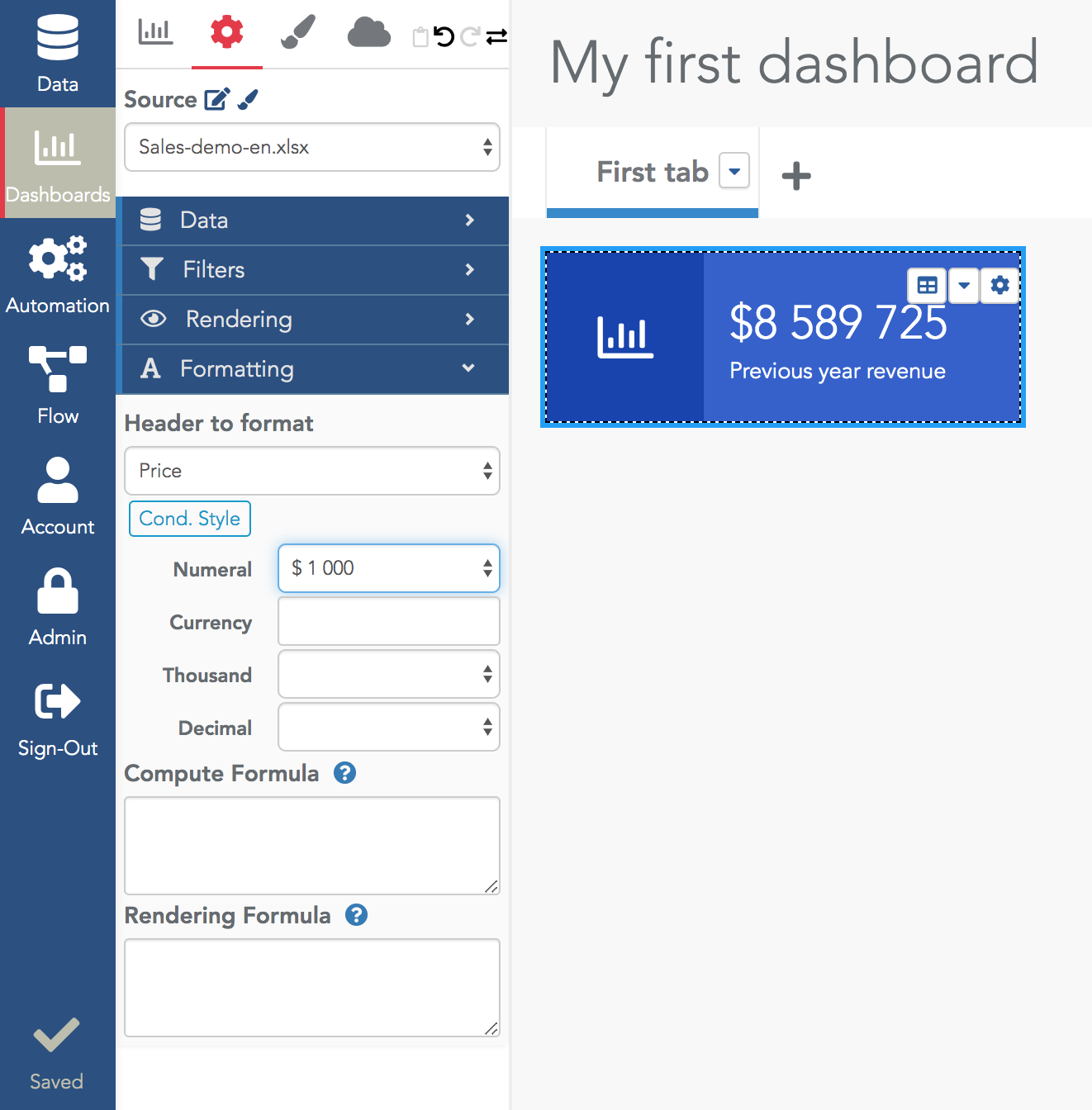
By default, the formatting is not satisfying (there are too many decimals in the above example). In the Formatting section, you can modify it. In the selector, choose your measure and edit its numeral type.
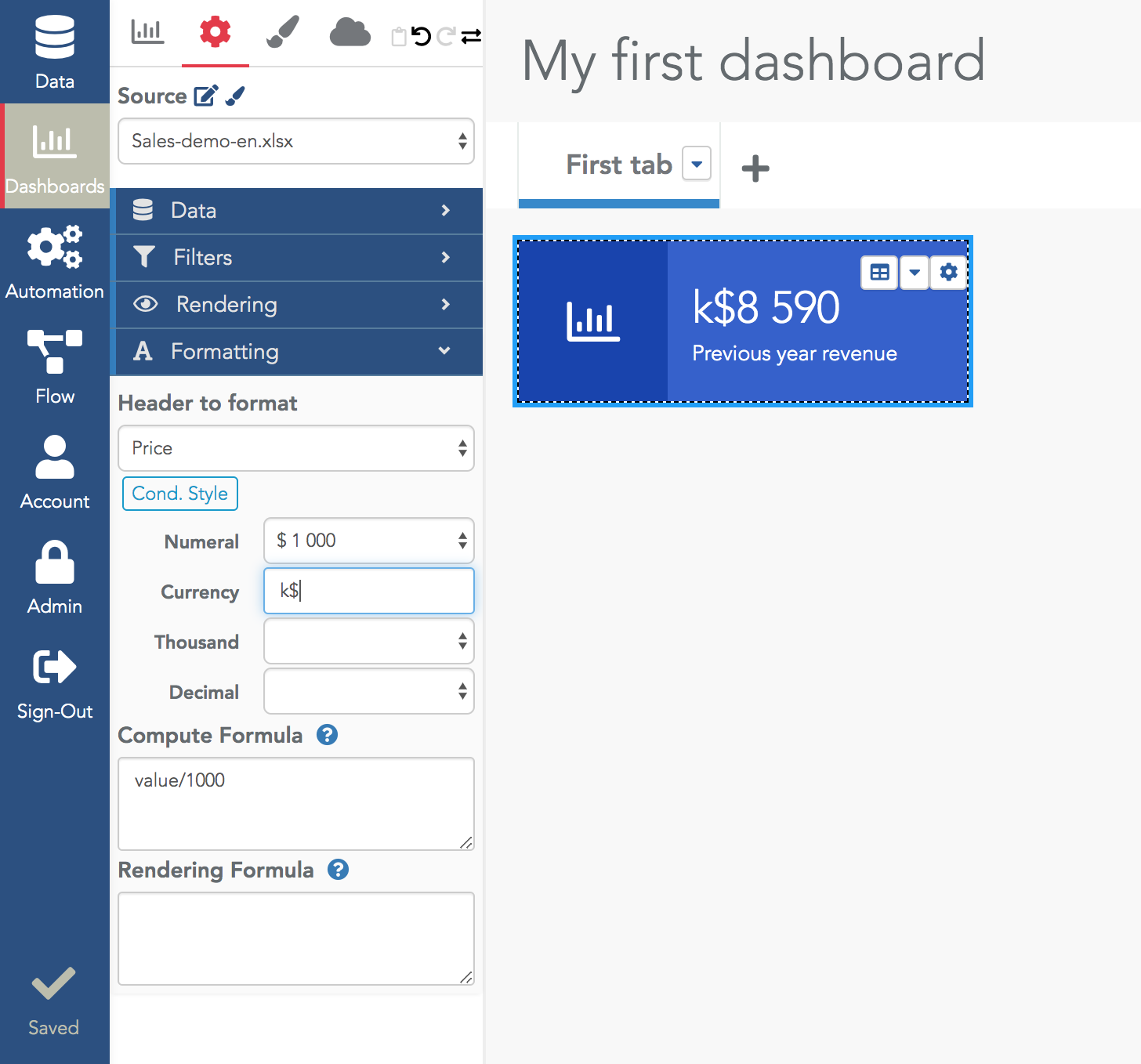
In Serenytics, values obtained from the data engine can be transformed just before being displayed. This is done in the Formatting section, with the computing and rendering formulas.
For example, in the widget below, the value is divided by 1000 (and of course, we use "k$" as currency in the numeral format):
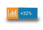
In the Rendering section, there are many possibilities to change the rendering of your widget. The most important one is the Template. The default rendering template is "Icon". With this template, the widget shows the value beside an icon. The settings let you change the icon and colors.
The most used template is the simplest one: "KPI with title". As the name says, it shows your KPI, a title and that's all: