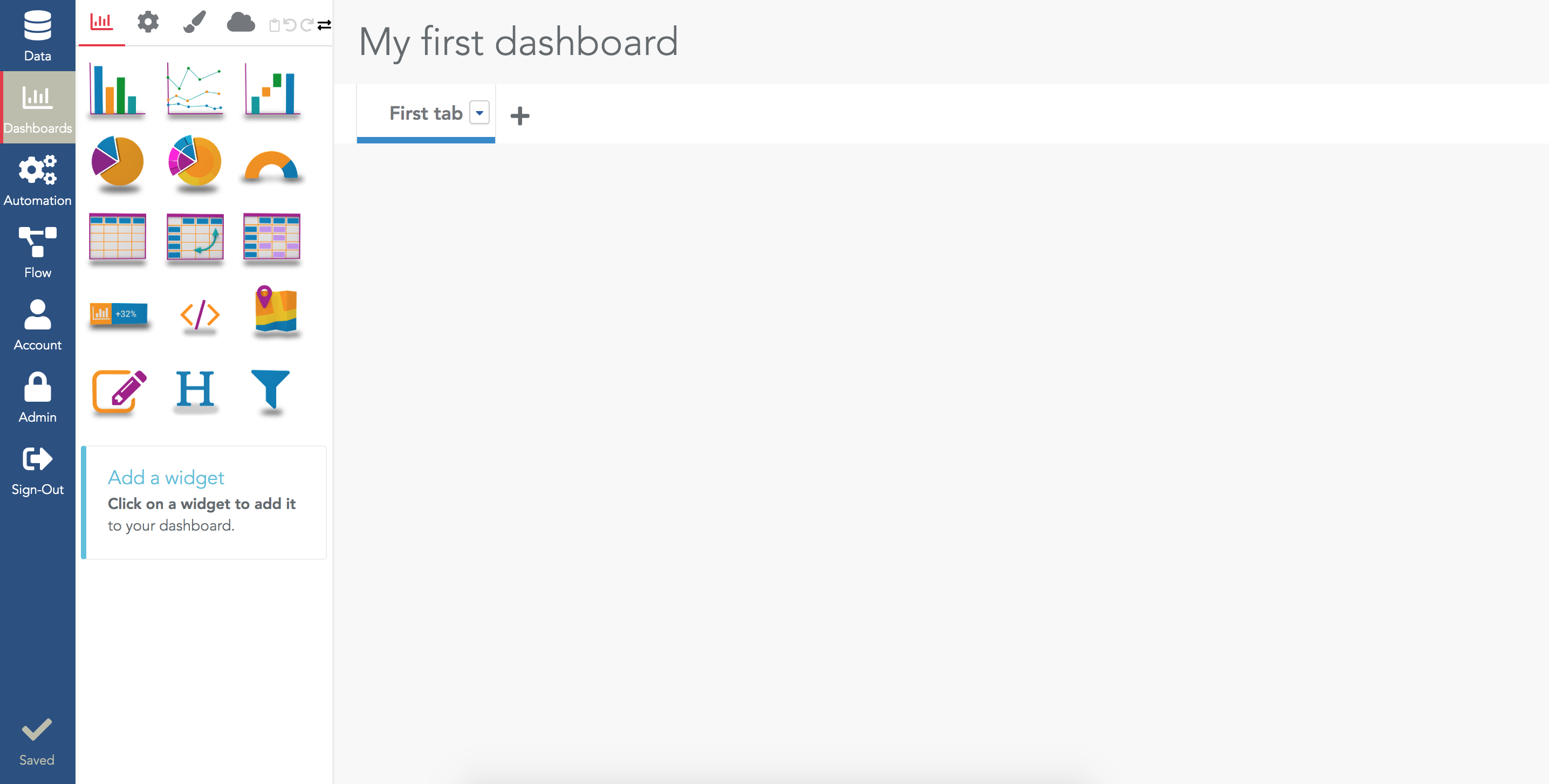
Create your first dashboard and first bar chart

Svg background
Create a dashboard
In the dashboard menu, click on the "New dashboard" button in the top right corner and enter your dashboard's name. This will open your newly created dashboard in our editor:
Empty dashboard after creation
The screen is split in two parts:
  • On the left, there is the configuration menu.
  • On the right, you see the dashboard under edition. Keep in mind this is the "editor" version of the dashboard. You will see later how to open this dashboard in Viewer mode (i.e. the way viewers will see this dashboard).
The configuration menu has four tabs and several icons:
Dashboard configuration menu
Create a barchart widget
To create a barchart, click on the barchart icon in the first tab of the configuration menu:
barchart icon
This adds a new barchart at the top of your dashboard:
Empty barchart, requires a datasource to be selected
There are several points to notice:
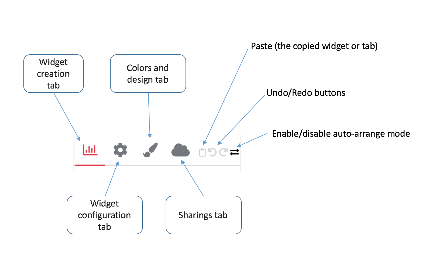
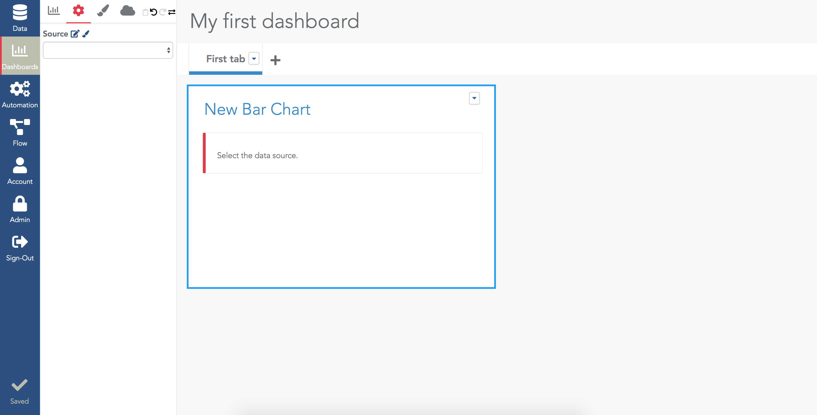
  • The widget has a blue border around it. It means it is selected.
  • The configuration menu automatically switched to the "widget configuration" tab (the second one). This tab always show the configuration of the selected widget.
As indicated by the widget, you must select a datasource where the widget will query its data. To do so, in the source field, select one datasource. When a source is selected, the next steps of the configuration are available in the configuration menu:
Configuration menu for the selected widget
To show data in the barchart, you need to provide the dimension to use on the X axis, and at least one measure in the Data section:
Minimal configuration for a barchart: one dimension and one measure.

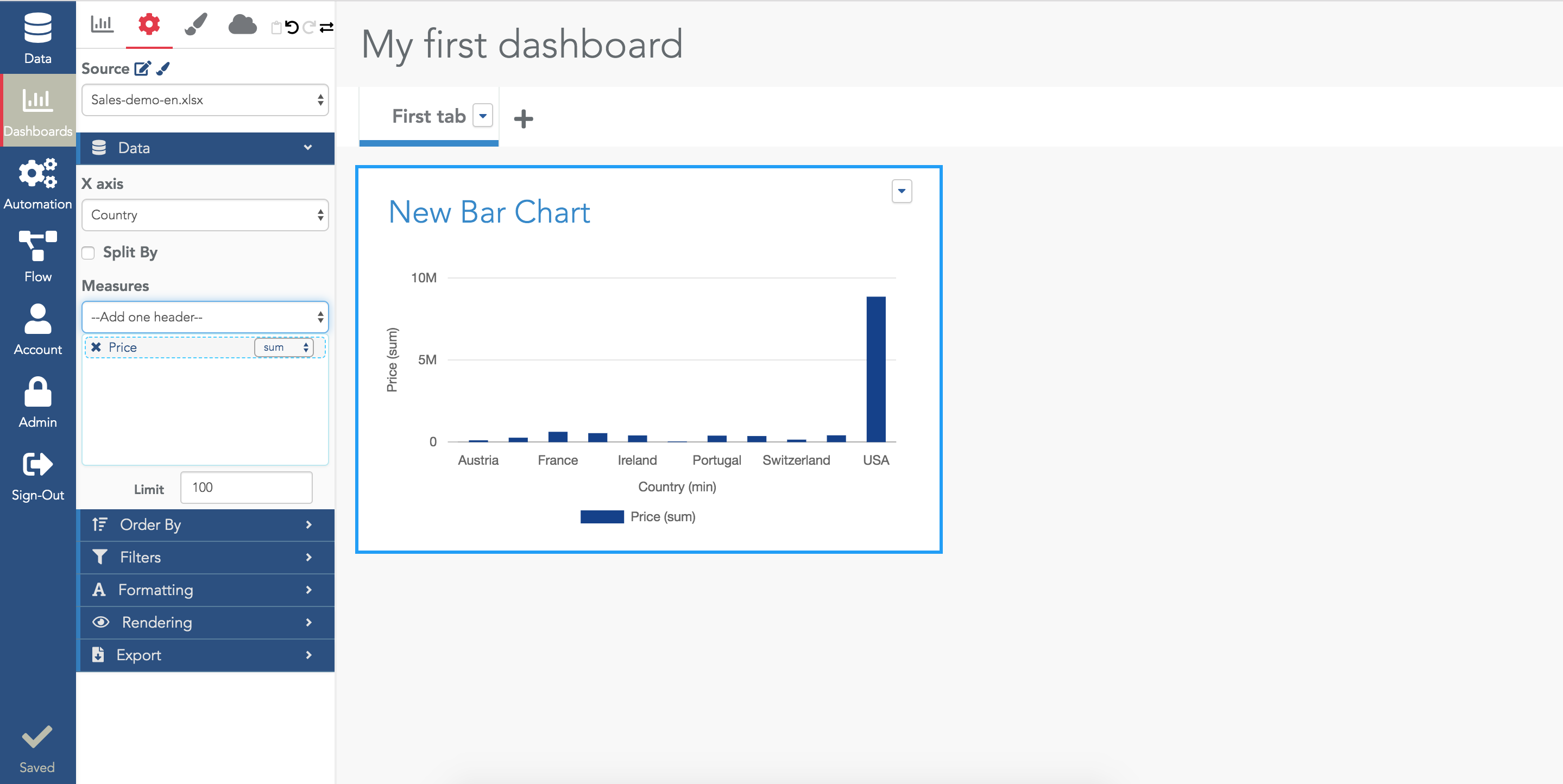
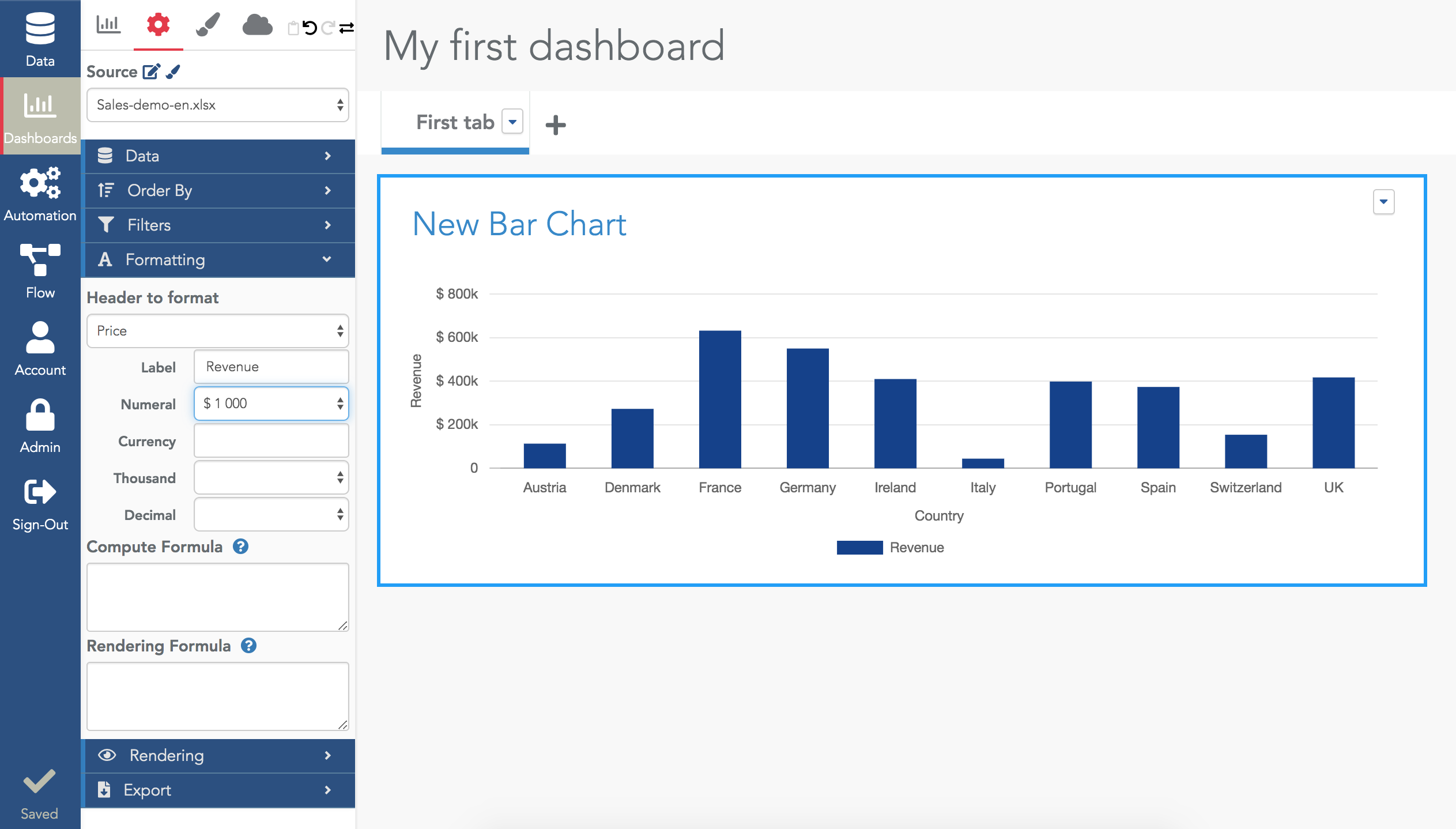
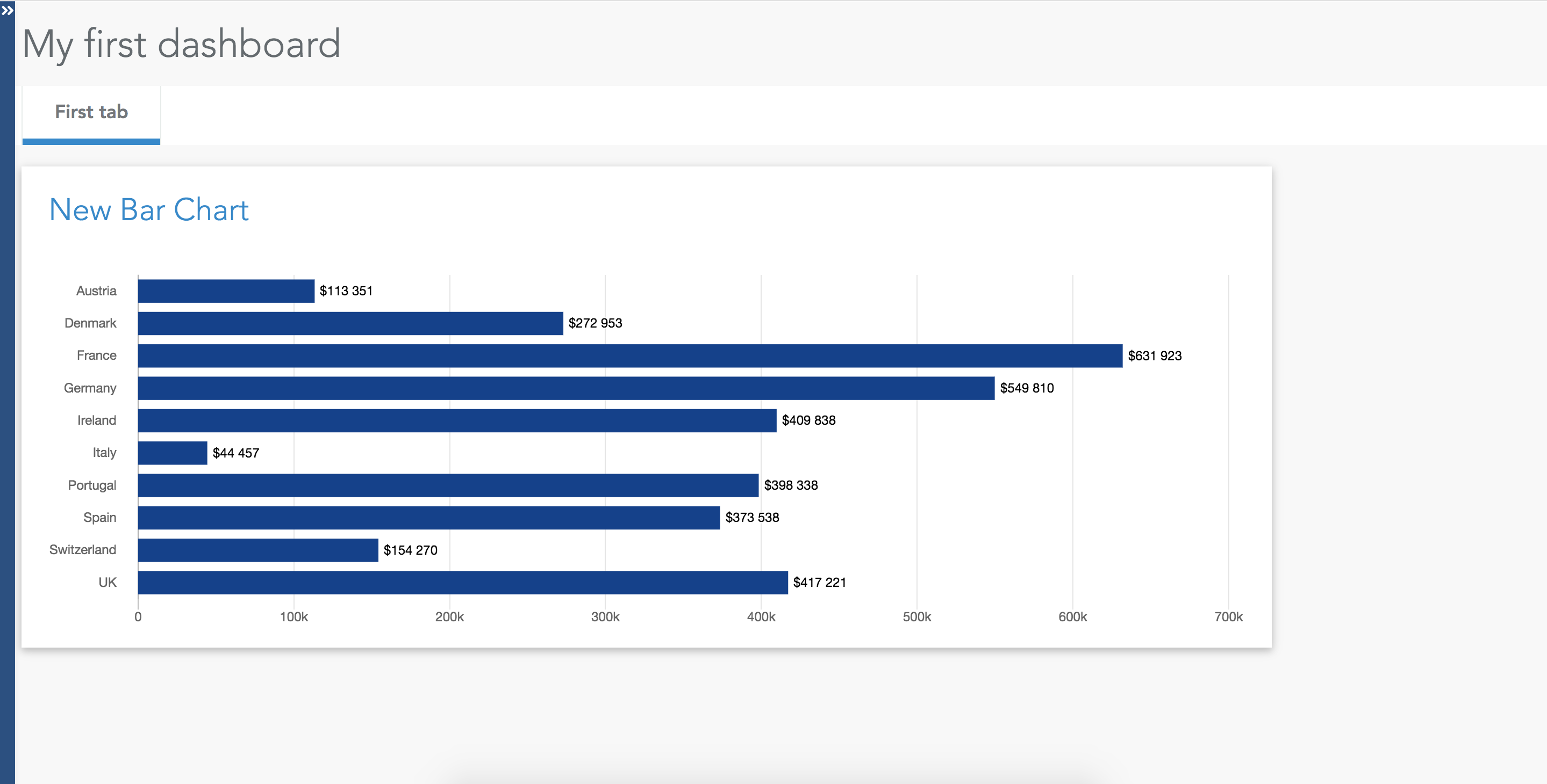
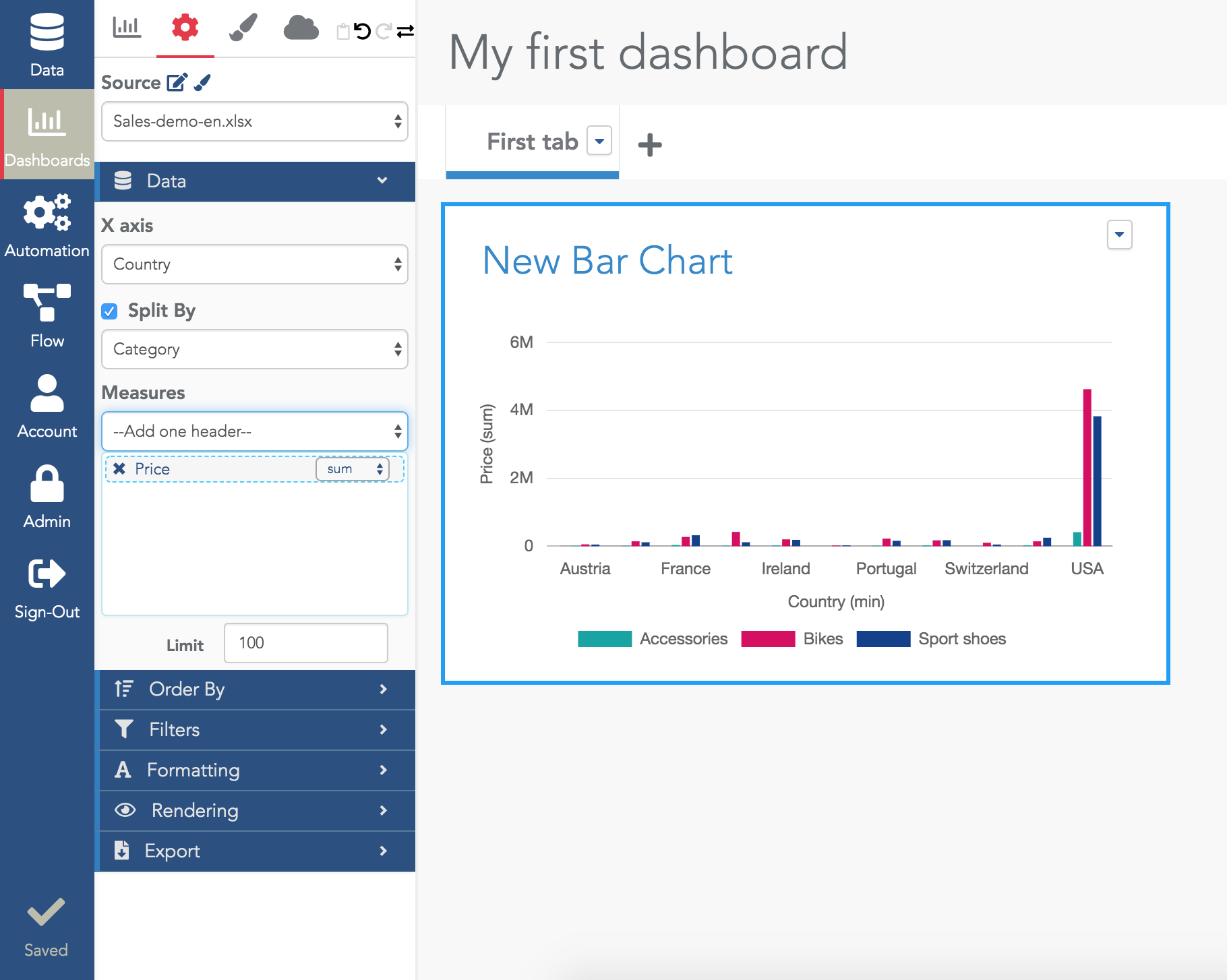
The provided configuration queries the datasource, asking for the "sum of column price grouped by Country". In this query:

  • Country is the dimension
  • Price is the measure (also called metrics)
  • The aggregation operator is "sum"

Use a time dimension
In the X axis field, if you select a column of type "datetime", you will be able to select the timerange of the aggregation (using the selector right below the selected column name):
Using a time dimension in a barchart.

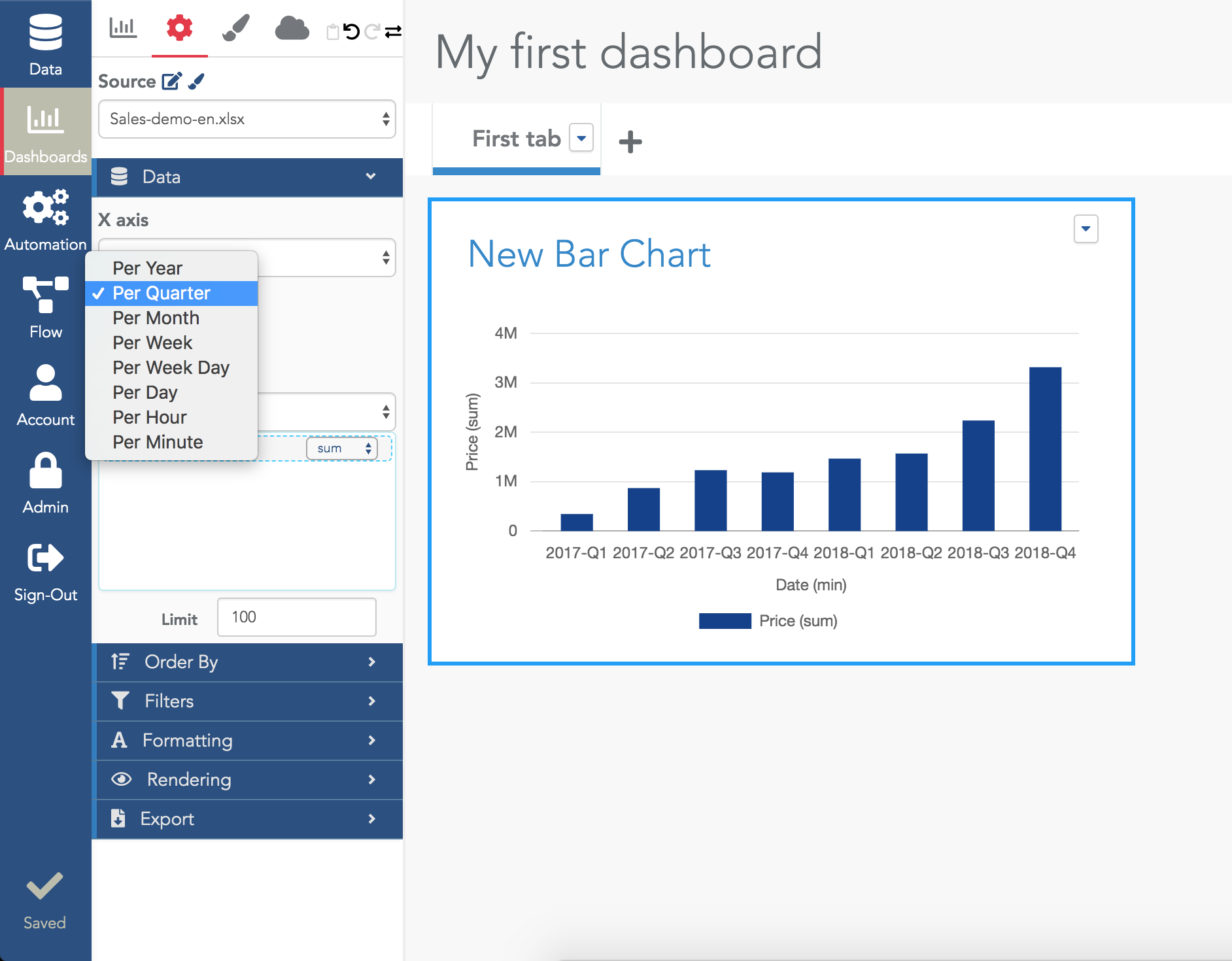
If the timerange options selector does not show up, it means the column is not detected as a datetime in the datasource. You need to check how this data was loaded and why the type detection does not work as you wish (maybe your column contain values which are not dates).

Count the number of rows
A classical query is to count the number of rows along a dimension (e.g. "number of rows per country"). To do that, in the measures field selector, you must select the "$$count$$" value (in Serenytics, $$count$$ is a name meaning "number of rows"):
Count in a barchart
Use two dimensions
You may need to show a metric along two dimensions (e.g. "sum of column price grouped by country and product category). To enable a second dimension in a barchart, check the "split by" option and select the second dimension in the field below:
Split by in a barchart to use a second dimension
Filter data

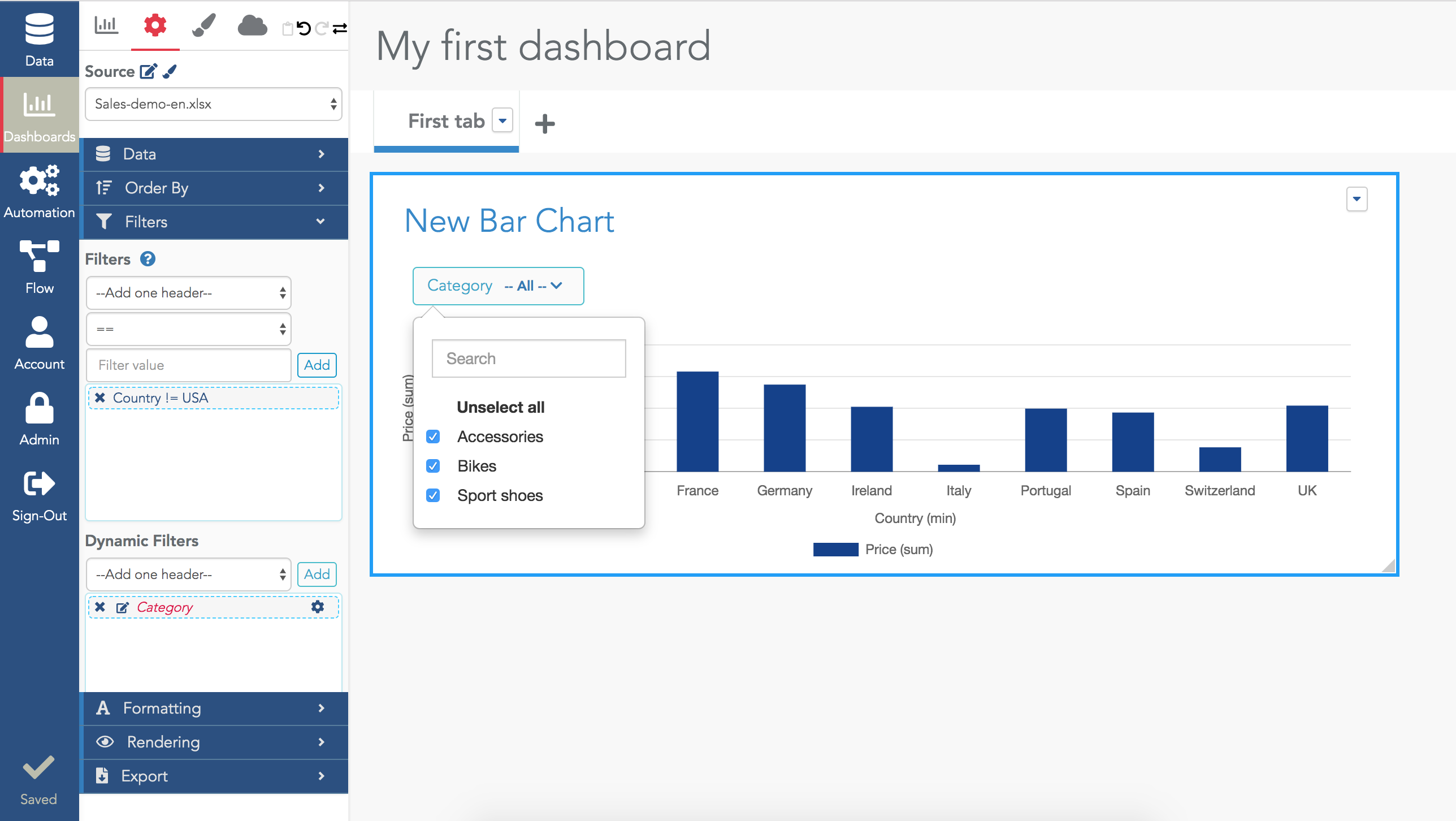
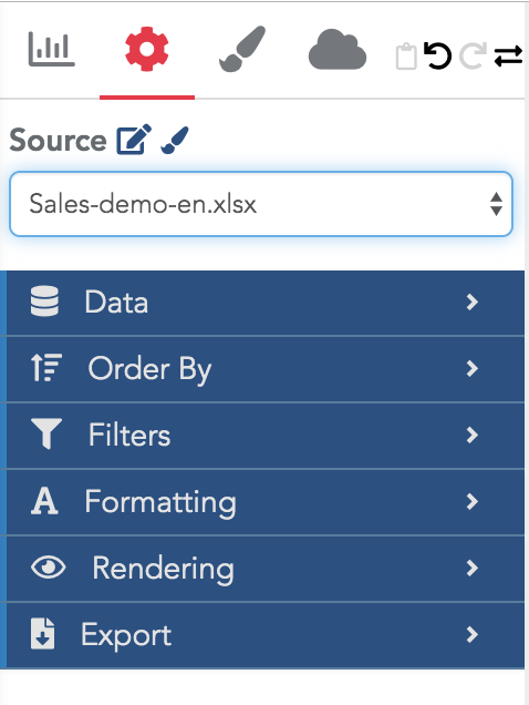
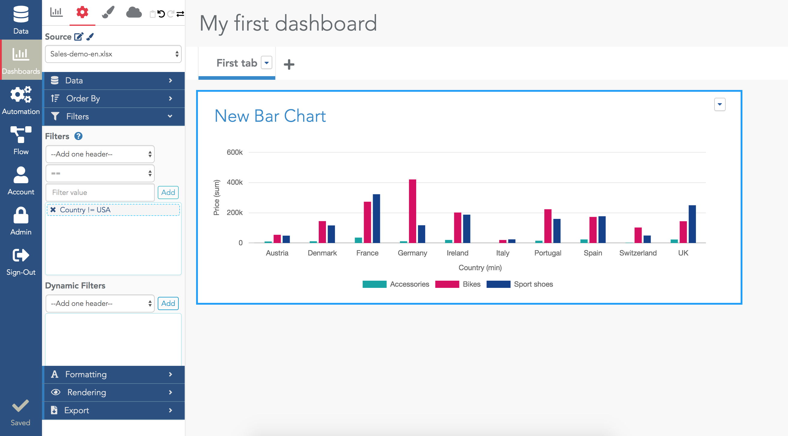
In the previous example, all the rows from the datasource were used. In many cases you want to add a filter on them to apply your query only to specific rows. To add filters, use the "Filters" section. Each filter requires a dimension, an operator and a value (although some operators such as "is_empty" do not require a value).

For example, to exclude rows having Country=USA in the above example:

Add static filters in a widget
Note that the operator "!=" means "different" in Serenytics.
Add a dynamic filter in the widget

In the above example, the filter was selected once and for all in the widget configuration (we call this a static filter). But in many cases, we want the viewer to be able to modify the filters himself.

To do that, you need to add a "dynamic filter" in the Filters section. Just select the dimension of the filter (e.g. "Category" in the example) and automatically, a selector will be shown at the top of the widget filled with all the possible values.

Add a dynamic filter in a widget.
Formatting
By default, the labels of the barchart axis are often not satisfying. For example, the vertical axis for the sum of the column price is labelled "Price(sum)". And the currency is not displayed. To fix these options, in the formatting menu, select the measure you want to configure and fill its settings:
Axis formatting
Rendering section
In the rendering menu, you have many options to change the way your barchart is drawn (use horizontal mode, show value, show a target bar...). The best way to learn is to try by yourself all these options and to see their impact on your barchart.
Rendering options
Export section
In this section, you can enable/disable the buttons that will allow the viewer to download the barchart (in CSV, XLX or as an image).
Open a dashboard in Viewer mode
So far, you have only seen the dashboard in studio mode (i.e. with all the options to edit it). To open it in Viewer mode, in the "Sharings" tab, click on "Open in Viewer mode":
Open a dashboard in the Viewer mode
This will open the dashboard exactly as other viewers will see it once you have share it with them. Note that on the left side of the viewer mode, there is a bar allowing the viewer to list all his dashboards and to logout.
Viewer mode
To know how to share your dashboards to a list of users, read the dedicated tutorial.
Conclusion
Following this tutorial, you are now able to create your first dashboard. As your modifications are applied immediately to your dashboard and visible, do not hesitate to try all the options, that's the best way to learn.
×