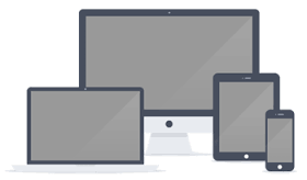
Multi-Devices / Responsiveness

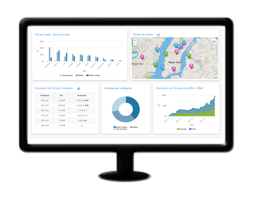
Our dashboards adapt to the device used for reading. Create your dashboard once, it is automatically compatible on tablet and smartphone.
Fluid means that the components and font sizes are automatically adapted to the device screen resolution.
Responsive means that below a given resolution, the layout is automatically adapted. For example, on a smartphone screen, our widgets are displayed one below each other and each one uses the full screen width.
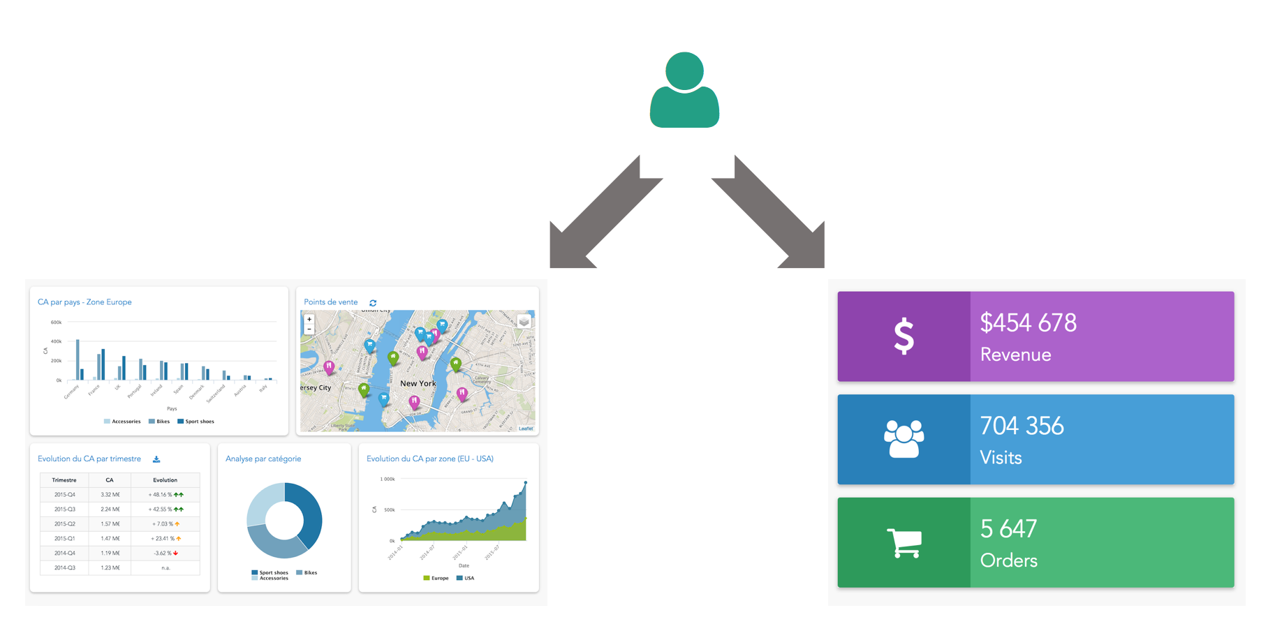
Depending on the size of the screen used by the Viewer, you can also redirect him to a different dashboard. If the user is on a smartphone, you can for example automatically redirect him to a dashboard with only the main KPIs displayed.
Serenytics dashboards can be used to display KPIs, often real-time, on a TV screen. It is then necessary to configure the dashboard to update its data on a regular basis, for example every 5 minutes.